Canadian rocket startup Nordspace obtains expanded ground station contract
Proposed Canadian spaceports
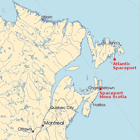
The Canadian rocket startup Nordspace has signed an agreement with the ground station company C-Core to establish more tracking and communication facilities in conjunction with Nordspace’s launch plans at its Atlantic spaceport in Newfoundland.
NordSpace and C-CORE have signed a Memorandum of Understanding (MOU) that will see the companies work together in developing new ground stations across Canada with initial locations planned for the Atlantic Spaceport Complex (ASX) in St. Lawrence, Newfoundland and Labrador, and Inuvik, Northwest Territories.
With C-CORE being based in St. John’s, Newfoundland, and already established in providing ground station services, it seems like a natural collaboration that could benefit both companies. For NordSpace, which owns and is developing the Atlantic Spaceport Complex, this collaboration provides the potential for another type of revenue source as the company tries to diversify.
Nordspace has not yet launched, though its first suborbital test launch several weeks ago was scrubbed twice due to ground equipment fuel leaks. It has not yet announced another date for that suborbital test, but plans a static fire test in October of the engine it is building for its orbital Tundra rocket.
This company is only three years old, and appears to have leap-frogged past Canada’s other spaceport operation in Nova Scotia, which has been trying to get off the ground for almost a decade.


