Sunspot update for April 2018: Heading into solar minimum

On Sunday NOAA posted its monthly update of the solar cycle, covering sunspot activity for April 2018. Below is my annotated version of that graph.

While there was an uptick in sunspots in April, compared to the almost complete inactivity in March (the least active month for sunspots in a decade), the uptick did little to change the general trend. Sunspot activity is now comparable to what we saw in early 2008 (as indicated by the yellow line). This was just before the arrival of the previous solar minimum, which happened to also be one of the longest and deepest on record.

» Read more

1 comment

Big earthquake in South Korea linked to geothermal power plant

South Korea’s second largest earthquake has now been linked by two different studies to the injection of water deep below the surface at a new geothermal power plant.

Perched on South Korea’s southeast coast and far from grinding tectonic plates, Pohang is an unlikely spot for a big earthquake. Before the geothermal plant’s two wells were drilled, there had never been an earthquake there of any significance, says Kwanghee Kim, a seismologist at Pusan National University in Busan, South Korea, and lead author of one study. But while Kim was monitoring the aftermath of an unrelated earthquake in 2016, he began to detect rumbles from Pohang. That prompted his lab to deploy eight temporary seismic sensors at the site, which were finally in place on 10 November 2017. He expected any quakes to be small—after all, the largest previous quake tied to enhanced geothermal power, in Basel, Switzerland, was just 3.4 in magnitude.

It took only 5 days to be proved wrong. “The Pohang earthquake was larger than any predicted by existing theories,” Kim says. Although some initial measures placed the source of the quake several kilometers away from the plant, Kim’s network revealed that the earthquake, and several of its foreshocks, all began right below the 4-kilometer-deep well used to inject water into the subsurface to create the plant’s heating reservoir. Indeed, it appears likely that the well’s high-pressure water lubricated an unknown fault in the rock, causing it to slip and triggering the quake, Kim says.

A second paper, by European scientists who used regional seismic data, reinforces the South Korean team’s results, in particular its shallow depth. That study also points out that an earlier 3.1-magnitude earthquake also took place near the well bottom, increasing the odds of a common source. Satellite measures of shifts in the surface after the November 2017 quake support that idea, says Stefan Wiemer, the second study’s lead author and director of the Swiss Seismological Service in Zurich. It’s clear the locked fault was storing energy that was waiting to be released, Wiemer says. “If that fault would have gone next Tuesday or 50 years from now, we’ll never know.”

The article notes that scientists had previously concluded that injecting water underground for geothermal purposes was okay (since it reduced use of fossil fuels) while doing the same for fracking (to obtain and use fossil fuels) was bad.. The data here actually suggests just the reverse, since fracking has never produced an earthquake as large as the 5.5 magnitude Pohang quake.

3 comments

Asian rivers produce almost all the world’s ocean pollution

A new study has found that 95% of all ocean pollution comes from only 10 rivers worldwide, and of those 8 are in Asia.

Dr Schmidt pooled data from dozens of research articles and calculated the amount in rivers was linked to the ‘mismanagement of plastic waste in their watersheds.’ He said: ‘The 10 top-ranked rivers transport 88-95 per cent of the global load into the sea.’

The study follows a recent report that pointed the finger at China, Indonesia, the Philippines, Thailand and Vietnam for spewing out most of the plastic waste that enters the seas. The Yangtze has been estimated in previous research to dump some 727 million pounds of plastic into the sea each year. The Ganges River in India is responsible for even more – about 1.2 billion pounds. A combination of the Xi, Dong and Zhujiang Rivers (233 million lbs per year) in China as well as four Indonesian rivers: the Brantas (85 million lbs annually), Solo (71 million pounds per year), Serayu (37 million lbs per year) and Progo (28 million lbs per year), are all large contributors.

The article also notes this:

More than half of the plastic waste that flows into the oceans comes from just five countries: China, Indonesia, Philippines, Vietnam and Sri Lanka. The only industrialized western country on the list of top 20 plastic polluters is the United States at No. 20.

The U.S. and Europe are not mismanaging their collected waste, so the plastic trash coming from those countries is due to litter, researchers said.

While China is responsible for 2.4 million tons of plastic that makes its way into the ocean, nearly 28 percent of the world total, the United States contributes just 77,000 tons, which is less than one percent, according to the study published in the journal Science.

So, the next time you see a wild-eyed leftwing environmentalist trying to blame western civilization, capitalism, and the U.S. for the world’s pollution, please remember this study. It is the free nations of the world that have nimbly reacted well to the problems of pollution, not communist dictatorships like China or Vietnam.

I should add that the record of democracies here is not perfect by far. The rivers of India are a big contributor to this pollution. That country needs to deal with this problem also.

16 comments

New method for scrubbing CO2 out of the air

Researchers have devised a new much more efficient technique for removing carbon dioxide from the smoke of power plants.

The memzyme meets the Department of Energy’s standards by capturing 90 percent of power plant carbon dioxide production at a relatively low cost of $40 per ton. Researchers term the membrane a “memzyme” because it acts like a filter but is near-saturated with an enzyme, carbonic anhydrase, developed by living cells over millions of years to help rid themselves of carbon dioxide efficiently and rapidly.

“To date, stripping carbon dioxide from smoke has been prohibitively expensive using the thick, solid, polymer membranes currently available,” says Jeff Brinker, a Sandia fellow, University of New Mexico regents’ professor and the paper’s lead author. “Our inexpensive method follows nature’s lead in our use of a water-based membrane only 18 nanometers thick that incorporates natural enzymes to capture 90 percent of carbon dioxide released. (A nanometer is about 1/700 of the diameter of a human hair.) This is almost 70 percent better than current commercial methods, and it’s done at a fraction of the cost.”

The article also notes at the end that this technology could also be adapted to scrubbing CO2 from spacecraft atmospheres.

Hat tip to reader MarcusZ1967.

15 comments

Environmental activists to build methane-detecting satellite

What could possibly go wrong? The Environmental Defense Fund (EDF), historically one of the U.S.’s most partisan and aggressive environmental activist groups, has announced that it has raised millions to build a satellite to measure atmospheric methane, with a launch aimed for 2020.

The EDF, which is based in New York City, aims to launch the satellite as early as 2020. The environmental group and its scientific partners at Harvard University and the Harvard-Smithsonian Center for Astrophysics in Cambridge, Massachusetts, say that their planned ‘MethaneSAT’ will make the most precise measurements of methane yet from space. Their goal is to monitor emissions from roughly 50 major oil and gas fields that account for around 80% of the world’s oil and gas production. But the satellite could also be used to estimate emissions from landfills and agriculture.

“We need good solid data so that we really can support global action on climate change, and we’ve got to do it fast,” says Steven Hamburg, the EDF’s chief scientist.

MethaneSAT is an offshoot of the EDF’s research on greenhouse-gas emissions from US oil and gas facilities. In 2012, the group spearheaded a collaboration with industry and academic scientists to better quantify methane emissions and identify leaky infrastructure, from the wellhead all the way to the urban distribution system. That work is ongoing, but suggests that methane emissions from oil and gas facilities exceed US government estimates. Last year, the EDF helped to launch another collaboration with industry partners, governments and academics to carry that research forward internationally. [emphasis mine]

While I applaud their effort to do real research, I have serious concerns about the objectivity of their work. It appears they are aiming this satellite to look specifically at oil and gas facilities, the big enemies of the global-warming community, and clearly wish to document evidence for human-caused global warming. Thus, it will not be surprising if their research results end up biased in these directions.

Nonetheless, this project’s funding, much of it from private sources, highlights the on-going shift away from government money for the funding of space missions, as did my previous post As noted at the link above,

The EDF declined to provide a precise cost estimate for its satellite because the design remains in flux, but said that it is likely to be in the tens of millions of dollars. The group is seeking extra support from philanthropists to operate the satellite once it’s in orbit. All the data will be freely available. Hamburg says that the project provides a new model for funding targeted space missions. “We’re going to be the first, but I think we’re going to see this approach be used by others as well,” he says.

9 comments

Sunspot update for March 2018: the sun crashes!

It surely looks like the solar minimum has arrived, and it has done so far earlier than expected! On Sunday NOAA posted its monthly update of the solar cycle, covering sunspot activity for March 2018. Below is my annotated version of that graph.

March 2018 was the least active month for sunspots since the middle of 2009, almost nine years ago. In fact, activity in the past few months has been so low it matches the low activity seen in late 2007 and early 2008, ten years ago when the last solar minimum began and indicated by the yellow line that I have added to the graph below. If the solar minimum has actually arrived now, this would make this cycle only ten years long, one of the shortest solar cycles on record. More important, it is a weak cycle. In the past, all short cycles were active cycles. This is the first time we have seen a short and weak cycle since scientists began tracking the solar cycle in the 1700s, following the last grand minimum in the 1600s when there were almost no sunspots.
» Read more

27 comments

North American mountains get 3Xs the snow previously estimated

The uncertainty of science: A new analysis based on computer models suggests that the mountains of North America get three times more snow each year than scientists has previously estimated.

Those figures come thanks to a new analysis in which researchers used computer simulations to estimate the typical annual snowfall in each of 11 North American mountain ranges. After supercomputer simulations of regional climate that would have taken 50 years on the average laptop, the team found that those mountain ranges receive about 3018 cubic kilometers of snow a year. Although those ranges together cover only about 25% of the area stretching from the Arctic Ocean down to Mexico’s southern border, they get about 60% of its snow, the researchers report in Geophysical Research Letters. That’s nearly three times the estimate for mountain snow from one previous study, the team notes.

First, this is based on computer simulations, not actual data in the field. I wouldn’t put much money on it. Second, it does show us how little climate scientists really know about the climate, as this simulation is still using all the knowledge they have, and it comes up with a conclusion that confounds them. Third, I was astonished the article didn’t try to push the idea that this larger estimate should be blamed on human-caused global warming. It didn’t, which I suppose is a sign of some progress.

0 comments

More evidence of data tampering at NOAA

A close review of NOAA’s historic temperature data for New York shows that the agency appears to have been adjusting its records to cool past records or warm recent ones, without any explanation.

The author took a look at NOAA’s graph this year showing New York’s average January temperatures going back to 1890, and noticed that, according to that graph, 1943 was 0.9 degrees Fahrenheit warmer than 2014. Yet, a close look at the actual data from 1943 strongly suggested that 1943 was actually 2.7F warmer, not 0.9F. Somehow, NOAA had adjusted the numbers, either in 1943 or in 2014, to make the present warmer or the past colder. Further analysis, removing the one station that appears to have experienced the most heat island influence, thus distorting its long term record, suggested the adjustments might actually be worse.

These results, while certainly not covering all weather stations and years, are still consistent with every other close look at NOAA’s adjustments. Those adjustments always cool the past and warm the present, so as to provide confirmation of the theory of global warming. More important, there is never any explanation for those adjustments.

Of the seven sites, six have remained at the same locations, within a few yards. The station at Auburn has moved by a couple of miles, but is still in similar terrain.

There is no reason then why any major adjustments should have been required at any site.

Apologists for temperature tampering usually say it is all due to TOBS (Time of Observation). Yet the station at Ithaca, based at Cornell University, has used morning readings throughout. With a temperature difference of 2.9C, this is typical of the other sites, suggesting that any bias from TOBS is minor.

Either there is outright fraud going on here in the climate divisions at NOAA, or they are entirely blind to their own confirmation bias. Either way, this data once again illustrates why there is great distrust in their results. Global warming might be happening, and human activity might be causing it, but these strange adjustments in the data leave many in doubt.

3 comments

Sunspot update for January 2018

Today NOAA posted its monthly update of the solar cycle, covering sunspot activity for January 2018. Below is my annotated version of that graph.

As you can see, the low sunspot activity of the past two months continued in January. November 2017 remains the most inactive month for sunspots since the middle of 2009. January is now the second most inactive month, with December a very close third.

January 2018 Solar Cycle graph

The graph above has been modified to show the predictions of the solar science community. The green curves show the community’s two original predictions from April 2007, with half the scientists predicting a very strong maximum and half predicting a weak one. The red curve is their revised May 2009 prediction.

Though activity continues to track close to but considerably below the 2007 weak prediction, the difference appears to be increasing as the ramp down to solar minimum continues. While I have said in past updates that the trend suggests an early arrival of the solar minimum, a close look at the previous ramp down in 2007 and 2008 shows that when activity became this weak, the ramp down slowed considerably. This previous pattern suggests that we could see another year or two of similarly low activity before the minimum arrives.

Regardless, the low activity, this soon, continues to suggest that the next maximum will also be weak, and might even not come at all, as some solar scientists have proposed. Instead, we might be heading toward another Grand Minimum, with no significant sunspots for decades.

Will that Grand Minimum produce cold weather worldwide, as it appears to have done during the last Grand Minimum in the 1600s? There is circumstantial evidence in the past decade that it might. We will not know, however, until it happens, and that possibility remains very uncertain.

4 comments

Polar bears are starving! (NOT)

Fake science: Two articles yesterday from the so-called science journals Nature and Science today illustrate once again how pervasive the corruption in the climate field has now spread to almost anything that relates to climate.

Both articles refer to a paper published this week in Science, though the Nature article is far more detailed and longer. Researchers had tracked 9 polar bears during the spring months in three separate years, and had found that 5 of them had lost weight during this time period. From the Nature article:

Polar bear calorie use in spring

On average, the bears needed nearly 12,325 kilocalories per day — 1.6 times more energy than previously thought. To meet such energy demands, a female bear on the spring sea ice should eat either one adult or 19 newborn ringed seals every 10 to 12 days, the scientists concluded.

But nearly half of the bears didn’t catch enough food — and were forced to fast or scavenge carcasses. These animals lost 10% of their body mass over about 10 days. “That’s dramatic,” says physiologist John Whiteman at the University of New Mexico in Albuquerque. It’s as if a person weighing 80 kilograms shed 8 kilograms in just over a week, he says.

Catching enough to eat isn’t the only challenge polar bears face. As rising temperatures thin the sea ice, wind and currents make it drift faster on the ocean surface. “Think about a treadmill,” says Merav Ben-David, a wildlife ecologist at the University of Wyoming in Laramie. If the sea ice moves faster under their paws, polar bears have to walk faster — or for longer — to remain in the same spot3, which forces them to expend more energy, she says. [emphasis mine]

Oh my god! The polar bears are dying! And global warming is killing them!

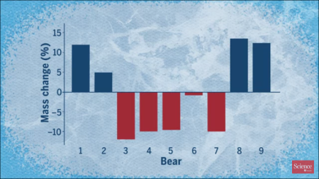
What a joke. A quick look at the graph above, captured from the Science video, reveals that what the researchers really found is that four bears lost weight, four bears gained weight, and one stayed about the same. The bears studied weren’t “starving,” they represented what looks like an ordinary cross-section of population.

Moreover, this study is incredibly uncertain in that it only studied 9 bears, and only during the spring months during three years. What happens during the rest of the year? What would happen if they studied a larger population? While the data here teaches us something about the polar bear’s diet, calorie intake and calorie requirements, it is absolutely insufficient to provide any conclusions about the future of the bear population.

Worse, while both articles were quick to mention the threat from global warming, neither mentioned that the polar bear population continues to thrive, and has been doing so for the past decade, with no declines in almost all Arctic regions.

Further compounding the bad reporting here, while both articles repeated their religious belief in global warming and the impending disappearance of the Arctic icecap, there remains zero evidence in all data gathered of the ice pack by satellites and ground research that the icecap is shrinking significantly. In fact, while it had shown a steady decline through the first decade of the 21st century, in the past few years there has been a marked recovery. While these scientists might want the ice cap to disappear for political reasons, it simply isn’t doing so.

This is junk journalism and fake science. In fact, it is downright pitiful. That the reporting at such important science journals as these has become so slipshod speaks badly for the future of science in general.

58 comments

Almost 500 science papers in 2017 challenge “global-warming consensus”

The uncertainty of science: A survey of climate papers published in 2017 shows that 485 directly challenged the so-called “consensus” that activists claim exists about global warming.

Author Kenneth Richard found that during the course of the year 2017, at least 485 scientific papers were published that in some way questioned the supposed consensus regarding the perils of human CO2 emissions or the efficacy of climate models to predict the future.

According to Richard’s analysis, the 485 new papers underscore the “significant limitations and uncertainties inherent in our understanding of climate and climate changes,” which in turn suggests that climate science is not nearly as settled as media reports and some policymakers would have people believe.

This really is not a surprise for anyone who spends even a little time reading actual climate research. If you do, you immediately realize that the absurd claims of politicians (mostly Democrats) and activists about the certainty of human-caused global warming are based on their complete ignorance of the science. Some examples:

My point isn’t to say that human-caused global warming isn’t happening. We simply don’t know. The evidence so far is very inconclusive. And for those who advocate this theory, their own models have consistently failed to match the data. Skepticism is called for, which by the way is actually the hallmark of good science.

31 comments

Sunspot update for December 2017

The precipitous decline in sunspots continues. While November 2017 remains the most inactive month for sunspots since the middle of 2009, December was a very close second.

Below is my annotated version of NOAA’s monthly update of the solar cycle, covering sunspot activity for December, which they posted on Sunday.

December 2017 Solar Cycle graph

The graph above has been modified to show the predictions of the solar science community. The green curves show the community’s two original predictions from April 2007, with half the scientists predicting a very strong maximum and half predicting a weak one. The red curve is their revised May 2009 prediction.

December 2017 sunspot record

The graph on the right, produced by SILSO (Sunspot Index and Long-term Solar Observations) on December 31, shows only 14 days during the month when there were sunspots active on the Sun’s visible hemisphere. This is only four more days then seen in November. And like November, the few sunspots were weak, resulting in tiny sunspot numbers total.

The first graph above illustrates how weak this on-going sunspot cycle has been. While the curve most closely matches the 2007 weak prediction of half the solar science community, it has one very notable difference. The actual ramp up to solar maximum started two years later than predicted, even though it appears to be ending when that prediction expected. The result is a very very short solar cycle, something that has historically always been associated with very active and intense sunspot activity. Instead, this short cycle has only seen weak activity, generally below all the predictions.

All signs continue to point to an early arrival of solar minimum. They also suggest that the next maximum will also be weak, and might even not come at all, as some solar scientists have proposed. Instead, we might be heading toward another Grand Minimum, with no significant sunspots for decades.

So, is it cold outside right now? Well, that’s weather, not climate. Nonetheless, there is a lot of circumstantial evidence that few sunspots correspond with a cooling climate on Earth. (The last grand minimum occurred in the 1600s, during what was called the Little Ice Age.) There is even some preliminary evidence to suggest that cosmic rays might be a cause. (Watch the video at the end of this link.).

Whether any of this will happen however remains unknown. We will need to wait to find out.

0 comments
1 20 21 22 23 24 82