Data suggests the winds in Jupiter’s Great Red Spot are changing

Changing wind speeds in Great Red Spot
Click for original image.
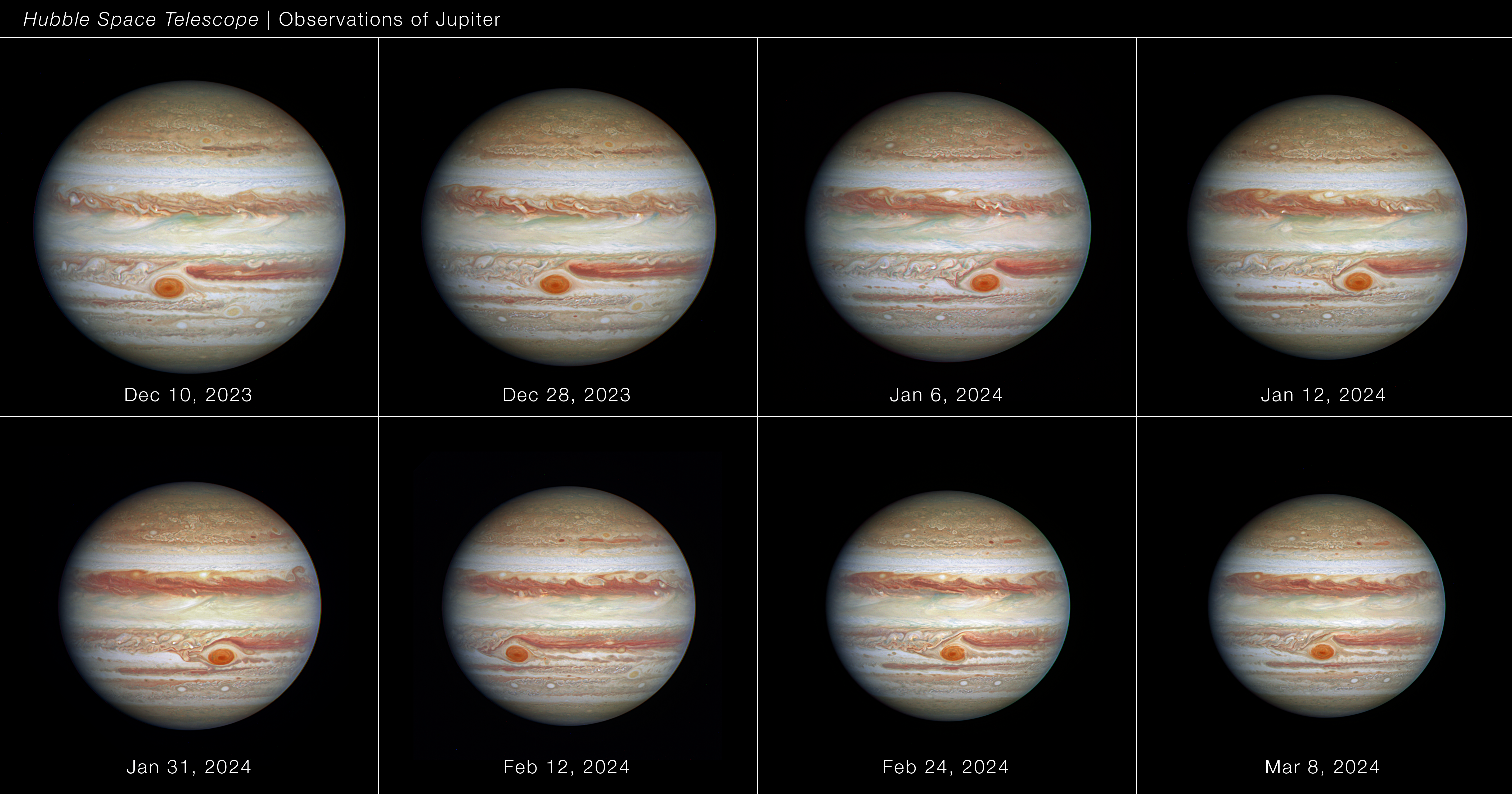
Data accumulated from 2009 to 2020 by the Hubble Space Telescope suggest that the outer winds in Jupiter’s Great Red Spot have speeded up by about 8%, while the winds in the spot’s inner regions have slowed.

The change in wind speeds they have measured with Hubble amount to less than 1.6 miles per hour per Earth year. “We’re talking about such a small change that if you didn’t have eleven years of Hubble data, we wouldn’t know it happened,” said Simon. “With Hubble we have the precision we need to spot a trend.” Hubble’s ongoing monitoring allows researchers to revisit and analyze its data very precisely as they keep adding to it. The smallest features Hubble can reveal in the storm are a mere 105 miles across, about twice the length of the state of Rhode Island.

“We find that the average wind speed in the Great Red Spot has been slightly increasing over the past decade,” Wong added. “We have one example where our analysis of the two-dimensional wind map found abrupt changes in 2017 when there was a major convective storm nearby.”

The graphic above shows the different wind speeds between the spot’s inner and outer regions, not the increase in speed described in this press release.

To put it mildly, these results are uncertain. We simply could be seeing the long term random fluctuations in the storm, or the change could simply be a reflection of the data’s margin of error. Moreover, since the data covers only the top layer of the Great Red Spot, it tells us nothing about the storm’s deeper regions or its more fundamental origins.

Jupiter’s changing and unchanging Great Red Spot

The changing Great Red Spot of Jupiter
Click for full figure.

In a paper published in March in the Journal of Geophysical Research: Planets, scientists (using images from amateurs, the Hubble Space Telescope, and Juno, scientists) have mapped out the interactions between Jupiter’s Great Red Spot, the longest known storm on the gas giant, and the smaller storms that interact with it as they zip past.

The series of images to the right come from figure 5 of their paper, showing the Spot over a period of three days. The Spot in these images is about 9,000 miles across, less than half the size it had been back in the late 1800s.

The black arrows mark the shifting location and shape of one smaller vortice as it flowed past the Spot from east to west along its northern perimeter, ripping off portions of the Spot as it passed. From the paper’s absract:

During its history, the [Great Red Spot] has shrunk to half its size since 1879, and encountered many smaller anticyclones and other dynamical features that interacted in a complex way. In 2018–2020, while having a historically small size, its structure and even its survival appeared to be threatened when a series of anticyclones moving in from the east tore off large fragments of the red area and distorted its shape. In this work, we report observations of the dynamics of these interactions and show that as a result the [Spot] increased its internal rotation velocity, maintaining its vorticity but decreasing its visible area, and suffering a transient change in its otherwise steady 90‐day oscillation in longitude.

…From the analysis of the reflectivity of the [Spot] and flakes and model simulations of the dynamics of the interactions we find that these events are likely to have been superficial, not affecting the full depth of the [Spot]. The interactions are not necessarily destructive but can transfer energy to the [Spot], maintaining it in a steady state and guaranteeing its long lifetime.

In other words, the changes seen only involved the Spot’s cloud tops, even if those tops were many miles thick. The storm itself is much deeper, with its base embedded strongly inside Jupiter and largely unaffected by these passing smaller storms.

Why the Spot exists and remains so long-lived remains an unsolved mystery.

Jupiter’s changing Great Red Spot, as seen by Juno

Montage of Jupiter's Great Red Spot since 2017
Click for full image.

Citizen scientist Björn Jónsson has compiled the montage to the right, reduced to post here, of the five times Jupiter’s Great Red Spot (GRS) was imaged by Juno during its repeated orbital fly-bys.

The mosaics show how the GRS and nearby areas have changed over the course of the Juno mission. The mosaics cover planetographic latitudes 4.7 to 38 degrees south.

The resolution of the source data is highly variable and this can be seen in some of the mosaics. The viewing geometry also varies a lot. Some of the images were obtained almost directly above the GRS (in particular some of the perijove 7 images) whereas other images were obtained at an oblique viewing angle (in particular the perijove 17 images).

These are approximately true color/contrast mosaics but there may be some inaccuracies in areas where the original images were obtained at a highly oblique angle. The contrast is also lower in these areas.

Some of the changes are remarkable, considering the short time involved. For example, note the appearance of the large white storm below the Spot in the third image, taken in December 2018. It wasn’t there in April 2018, and was gone by Feburary 2019. This doesn’t mean it had dissipated. Instead, the storm is in a different band which moves at a different speed than the band that the Spot is in. It has thus simply moved away.

This movement is even more remarkable when we remember that the Great Red Spot is about the width of the Earth.

Jupiter’s changing Great Red Spot

The changing Great Red Spot
Click for full resolution image.

Using Juno images produced during four different orbits, beginning in July 2017 through February 2019, citizen scientist Björn Jónsson has created a montage, reduced in resolution to post on the right, that shows the changes that have occurred in Jupiter’s Great Red Spot during that time. As he writes,

This is a montage of four map-projected [Spot] mosaics processed from images obtained during these perijoves (at the time of this writing perijove 20 is the most recent perijove). The mosaics show how the [Spot] and nearby areas have changed over the course of the Juno mission. The mosaics cover planetographic latitudes 4.7 to 38 degrees south.

The resolution of the source data is highly variable and this can be seen in some of the mosaics. The viewing geometry also varies a lot. Some of the images were obtained almost directly above the [Spot] (in particular some of the perijove 7 images) whereas other images were obtained at an oblique viewing angle (in particular the perijove 17 images).

These are approximately true color/contrast mosaics but there may be some inaccuracies in areas where the original images were obtained at a highly oblique angle. The contrast is also lower in these areas.

What strikes me the most is how the Spot itself seems relatively unchanged, while the bands and surrounding cloud formations changed significantly during this time.

The Great Red Spot from Juno

Jupiter's Great Red Spot

Cool image time! Citizen scientists Gerald Eichstädt and Seán Doran have released two new images that they have processed from the Juno raw image archive that were taken during the most recent spacecraft fly-by of Jupiter. The image to the right, cropped and reduced to post here, shows the Spot as the spacecraft was flying past. If you click on the image you can see their full image, processed by them to bring out the details and colors.

Even more spectacular, though unfortunately much too short, is the gif animation they have produced combining a number of images from this fly-by. I have embedded this animation below the fold. If you watch closely, you can see the rotation of this gigantic storm, including the motion of the jet streams within it.
» Read more

Flying through Jupiter’s Great Red Spot

Cool movie time! In conjunction with the release yesterday of data from Juno’s first close fly-over of Jupiter’s Great Red Spot, the science team also released an animation of what it would be like to fly down into the Spot.

You can also download the mp4 file here. It is definitely worth watching. It illustrates forcefully how daunting and challenging it will be for the human race to ever explore the vastness of Jupiter. This simulated plunge only goes into the Great Red Spot a few hundred miles, and barely touches its dynamics.

Juno’s look at Jupiter’s Great Red Spot

The Juno science team released its results from the spacecraft’s first close fly over of Jupiter’s Great Red Spot in July 2017.

Jupiter’s Great Red Spot is a giant oval of crimson-colored clouds in Jupiter’s southern hemisphere that race counterclockwise around the oval’s perimeter with wind speeds greater than any storm on Earth. Measuring 10,000 miles (16,000 kilometers) in width as of April 3, 2017, the Great Red Spot is 1.3 times as wide as Earth.

“Juno found that the Great Red Spot’s roots go 50 to 100 times deeper than Earth’s oceans and are warmer at the base than they are at the top,” said Andy Ingersoll, professor of planetary science at Caltech and a Juno co-investigator. “Winds are associated with differences in temperature, and the warmth of the spot’s base explains the ferocious winds we see at the top of the atmosphere.”

The future of the Great Red Spot is still very much up for debate. While the storm has been monitored since 1830, it has possibly existed for more than 350 years. In the 19th century, the Great Red Spot was well over two Earths wide. But in modern times, the Great Red Spot appears to be diminishing in size, as measured by Earth-based telescopes and spacecraft. At the time NASA’s Voyagers 1 and 2 sped by Jupiter on their way to Saturn and beyond, in 1979, the Great Red Spot was twice Earth’s diameter. Today, measurements by Earth-based telescopes indicate the oval that Juno flew over has diminished in width by one-third and height by one-eighth since Voyager times.

The storm’s estimate depth, about 200 miles, seems gigantic, but then we must remember this storm is on a gas giant that is about 88k miles in diameter, about ten times larger than Earth. The relative size of this storm to the size of Jupiter therefore is really not that much different than the relative size of big hurricanes on Earth. At the same time, the realities here are daunting, filled with unknowns, chief of which is the fact that unlike Earth, the Great Red Spot is a storm that is floating high in the atmosphere with no solid surface below it.

Juno images of Great Red Spot released

The Juno science team has released the images taken by Juno as it flew past Jupiter’s Great Red Spot on June 11.

The three images at the link were all processed by citizen scientists, who took the raw images provided immediately and enhanced the colors. Not surprisingly, the images reveal that there are storms within storms within storms inside the Spot, which itself is a storm, the largest in the solar system.

Great Red Spot hottest spot on Jupiter

Jupiter’s Great Red Spot, a giant storm that has been raging for at least three centuries, turns out to be the hottest spot on Jupiter.

They suspect that the spot is heated from below, but really understand much else, or even that.

Juno is specifically designed to study the weather patterns of Jupiter, so we will get some of these answers, plus a lot more questions, in the coming years as the spacecraft gathers its data.

Cosmic rays cause the red in Jupiter’s Great Red Spot

New ground-based chemistry research suggests that the bombardment of cosmic rays in Jupiter’s upper atmosphere could be the cause of the red color of the gas giant’s Great Red Spot.

They found that one of the spot’s major components, ammonium hydrosulfide, breaks down when exposed to that radiation in such a way that it turns red. They also think that ultraviolet radiation, also prevalent in space, will do the same.

New weather maps of Jupiter

Using the Hubble Space Telescope astronomers have compiled a new set of maps of Jupiter, showing changes in the gas giant’s bands and spots, including the Giant Red Spot.

The scientists behind the new images took pictures of Jupiter using Hubble’s Wide Field Camera 3 over a ten-hour period and have produced two maps of the entire planet from the observations. These maps make it possible to determine the speeds of Jupiter’s winds, to identify different phenomena in its atmosphere and to track changes in its most famous features.

The new images confirm that the huge storm, which has raged on Jupiter’s surface for at least three hundred years, continues to shrink, but that it may not go out without a fight. The storm, known as the Great Red Spot, is seen here swirling at the centre of the image of the planet. It has been decreasing in size at a noticeably faster rate from year to year for some time. But now, the rate of shrinkage seems to be slowing again, even though the spot is still about 240 kilometres smaller than it was in 2014.

Jupiter’s shrinking Great Red Spot.

Jupiter’s shrinking Great Red Spot.

In the 1880s the GRS resembled a huge blimp gliding high above white crystalline clouds of ammonia and spanned 40,000 km (25, 000 miles) across. You couldn’t miss it even in those small brass refractors that were the standard amateur observing gear back in the day. Nearly one hundred years later in 1979, the Spot’s north-south extent has remained virtually unchanged, but it’s girth had shrunk to 25,000 km (15,535 miles) or just shy of two Earth diameters. Recent work done by expert astrophotographer Damian Peach using the WINJUPOS program to precisely measure the GRS in high resolution photos over the past 10 years indicates a continued steady shrinkage.

Lots more fascinating information at the link. Read it all.