The Sun turns
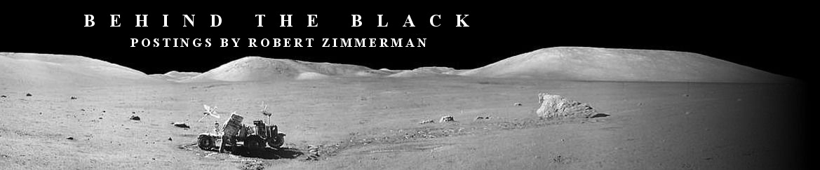
NOAA today posted its monthly update of the solar cycle, covering sunspot activity for January. As I do every month, I am posting it here with annotations to give it context.
The graph above has been modified to show the predictions of the solar science community. The green curves show the community’s two original predictions from April 2007, with half the scientists predicting a very strong maximum and half predicting a weak one. The red curve is their revised May 2009 prediction.
Since my last solar cycle update, sunspot activity showed a slight increase in activity when compared to the previous month. Overall, however, the ramp down from solar maximum continues to underperform the predictions, and suggests that this solar maximum will not only be a very weak one, but a short one as well.
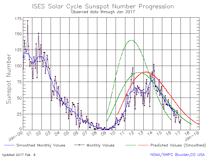
January’s activity however illustrated a statistical phenomenon that is typical of the sunspot count. That count is determined not by the numbers of sunspots on the entire surface of the Sun, but on the sunspots visible on the side of the Sun facing the Earth. Since it is not unusual for one face to be more active than the other, as we transition from maximum to minimum the sunspot counts will often show a more pronounced up-and-down curve reflecting this fact. Since the Sun’s day equals about 27 Earth days, this means that about every two weeks the active side will dominate our view until it rotates away and the inactive side reveals itself for two weeks.
This pattern was very evident in January, as shown by the graph on the right and obtained from here. During the first two weeks of the month the Sun was blank. Then that inactive face rotated out of view. For the next two weeks or so the sunspot count went up, then began to drop as the active face began to rotate out of view to be replaced by the blank face last seen in early January.
This pattern of course is very fluid, as at any time the inactive face can become more active and the active face less so. Nonetheless, for short periods covering one to three months it helps to partly explain the up-and-down pattern of sunspot fluctuations during this time period when large portions of the Sun’s face are blank.

On Christmas Eve 1968 three Americans became the first humans to visit another world. What they did to celebrate was unexpected and profound, and will be remembered throughout all human history. Genesis: the Story of Apollo 8, Robert Zimmerman's classic history of humanity's first journey to another world, tells that story, and it is now available as both an ebook and an audiobook, both with a foreword by Valerie Anders and a new introduction by Robert Zimmerman.
The print edition can be purchased at Amazon or from any other book seller. If you want an autographed copy the price is $60 for the hardback and $45 for the paperback, plus $8 shipping for each. Go here for purchasing details. The ebook is available everywhere for $5.99 (before discount) at amazon, or direct from my ebook publisher, ebookit. If you buy it from ebookit you don't support the big tech companies and the author gets a bigger cut much sooner.
The audiobook is also available at all these vendors, and is also free with a 30-day trial membership to Audible.
"Not simply about one mission, [Genesis] is also the history of America's quest for the moon... Zimmerman has done a masterful job of tying disparate events together into a solid account of one of America's greatest human triumphs."--San Antonio Express-News
I don’t get why the 2017 graph shows a peak of 70 spots while the longer-term graph shows about 20 spots on average during the last year. I doubt the day to day variation is equal to an entire 11 years cycle from top to bottom. Do they use a different definition of sunspots on those shorter time scales? The common standard is a bit archaic on purpose to maintain historical comparability of trends and levels.
The Sun’s differential surface rotation, varying from 25 days at the equator to 35 days at its polar regions messes up any periodicity on a monthly time scale. So called butterfly diagrams illustrate how sunspots migrate, or are formed and ceased, systematically along their latitude, during a sunspot cycle period because of that differential rotation.
LocalFluff: You appear to be misreading the graphs. The longer-term graph shows average monthly values, not the day to day sunspot numbers. The 2017 graph only covers most of January 2017 and the first week of February 2017, and shows the actual count for each day. That’s why the 70 count in January on the 2017 graph does appear on the longer term graph.
In addition, the two graphs use a slightly different definition of sunspot numbers, so while their numbers might differ a little bit, they are relatively identical so that the line of the graphs when plotted for the same time period will be practically the same.
So there were suddenly 75 sunspots two weeks ago? As many as during the three year long average of the last cycle maximum. I’d be surprised if they vary that much so quickly. Some unit or something must be misunderstood here.
LocalFluff: The sunspot number isn’t the equivalent of a count of actual sunspots. See for example this page: The sunspot count for today is 22, even though only 2 sunspots are visible on the face of the Sun.
Solar scientists use a complex algorithm to calculate the number based on the number of spots visible. Don’t ask me to explain it, but it really doesn’t matter, as the system has been used pretty much consistently for more than a century.
I’m confused….is there any reliable scientific evidence showing any causation relating sunspots, their number/periodicity to actual measurable effects of the earth’s climate or weather patterns, the ocean temperatures, et al?????
Jwing: In a word, no. There is a lot of circumstantial evidence that suggests a link to climate variations, such as the Little Ice Age in the 1600s corresponding to the last grand minimum of no sunspots, as well as the Medieval Warm Period corresponding to a period of suspected high sunspot activity around the year 1000. Our knowledge of the Sun’s brightness variations however remains somewhat limited, and so we do not know yet.
Thanks…love listening to you on John Batchelor’s Show!