Sunspot update: More evidence of an upcoming weak maximum
On July 4th NOAA updated its monthly graph tracking the monthly activity of sunspots on the Sun’s visible hemisphere. Below is that updated graph, annotated by me to show the past and new solar cycle predictions.
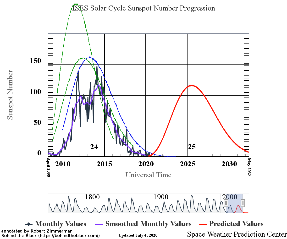
The graph above has been modified to show the predictions of the solar science community for both the previous and upcoming solar maximums. The green curves show the community’s two original predictions from April 2007 for the previous maximum, with half the scientists predicting a very strong maximum and half predicting a weak one. The blue curve is their revised May 2009 prediction. The red curve is the new prediction, first posted by NOAA in April 2020.
June saw an uptick of activity since my last update, though that activity remains quite low. We saw two sunspots during the month, both with polarities that link them to the next maximum and thus providing evidence that we will have a maximum in about five or six years. The first of those sunspots was also one of the strongest new cycle sunspots yet seen, and lasted for almost two weeks before it rotated off the visible face of the sun.
The ratio of next cycle sunspots vs sunspots from the past maximum has also been shifting. More and more, the new sunspots belong to the next cycle and less to the last. The ramp up to the next maximum is definitely beginning, though to call it a “ramp up” at this point is a big exaggeration. Sunspot activity remains low, though the last few months have seen some activity, unlike the seven months of nothing seen during the second half of last year.
The upcoming prediction for the next maximum calls for it to be very weak. Interestingly, the activity in June surpassed that prediction. This does not mean that the prediction will be wrong, only that June was more active when compared to the smooth prediction curve. As the cycle unfolds the monthly numbers will fluctuate up and down, as they did last cycle. The question will be whether their overall numbers will match closely with the prediction. In the past cycle actual sunspot activity was consistently below all predictions. It is too soon to say how well the new prediction is doing.