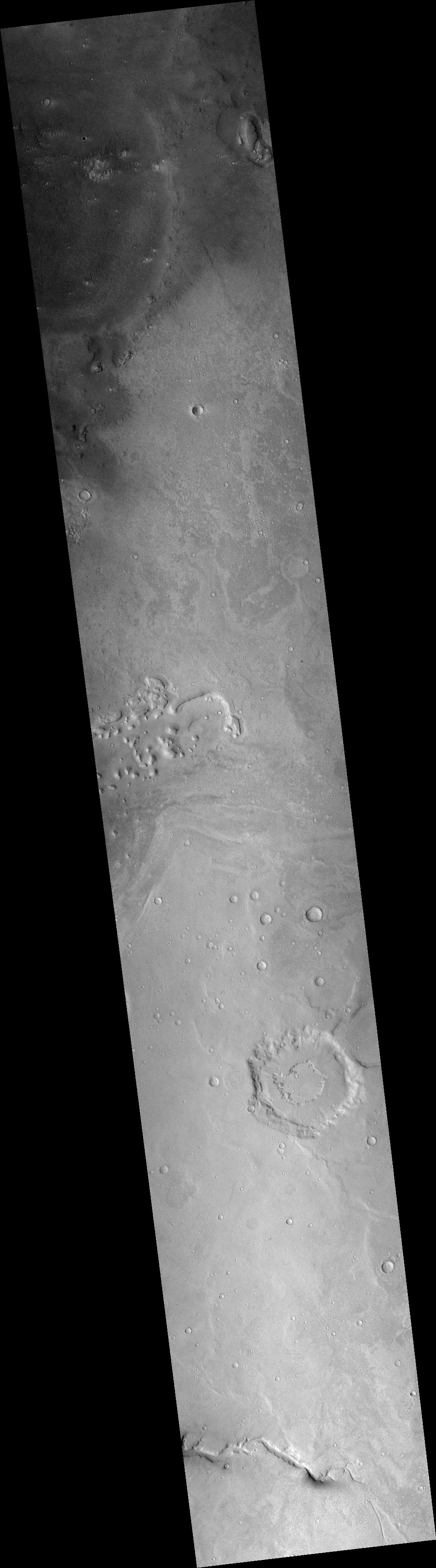
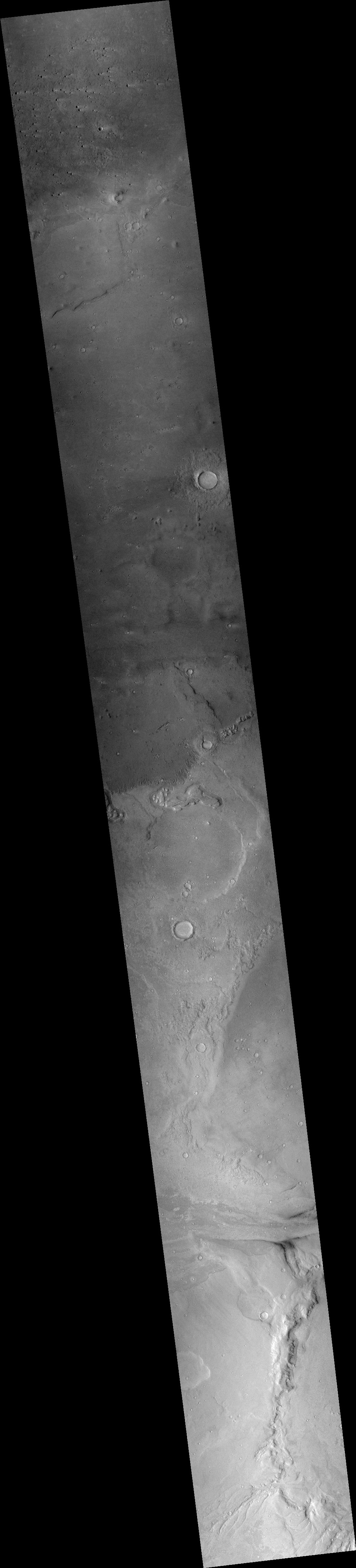
Have astronomers using Kepler discovered the first exomoon?

The uncertainty of science: Using data from Kepler astronomers think they have spotted the first exomoon, orbiting a star 4,000 light years away.

They think it might be the size of Neptune, and orbits a planet about ten times more massive than Jupiter.

All this is unconfirmed, however, especially because their conclusions are based on data from only three transits. They plan to use the Hubble Space Telescope to do more observations and hopefully confirm the discovery.

Cameras on next Kepler-like exoplanet space telescope out of focus

NASA has revealed that the cameras on the Transiting Exoplanet Survey Satellite (TESS) become slightly out of focus when they are cooled to -75 Celsius, the temperature they will experience in space.

NASA has also decided that the fuzziness is not enough to require a fix, and is proceeding with the mission as is, despite concerns expressed by scientists.

Alan Boss, an astronomer with the Carnegie Institution, brought up the issue in a summary of a meeting last week of the Astrophysics Advisory Committee, of which he is a member. “That could have some big effects on the photometry,” he said of the focus problem. “This is certainly a concern for the folks who know a lot about photometry.”

TESS will use those cameras to monitor the brightness of the nearest and brightest stars in the sky, an approach similar to that used by Kepler, a spacecraft developed originally to monitor one specific region of the sky. Both spacecraft are designed to look for minute, periodic dips in brightness of those stars as planets pass in front of, or transit, them. Chou said that since TESS is designed to conduct photometry, measuring the brightness of the stars in its field of view, “resolution is less important compared to imaging missions like Hubble.” However, astronomers are concerned that there will be some loss of sensitivity because light from the stars will be spread out onto a slightly larger area of the detector.

“The question is how much science degradation will there be in the results,” Boss said. “The TESS team thinks there will be a 10 percent cut in terms of the number of planets that they expect to be able to detect.”

It could be that NASA has decided that the cost and delay required to fix this is not worth that 10% loss of data.

Judge okays TMT permit

In a 305-page decision, an Hawaiian judge has approved a new construction permit for the Thirty Meter Telescope (TMT) on Mauna Kea.

This does not mean that the project now proceeds.

This isn’t the final say on whether the embattled project will proceed.

Now that Amano has issued her 305-page proposed decision and order, the state land board will set a deadline for telescope opponents and permit applicants to file arguments against her recommendations. The board will later hold a hearing and then make the final decision on the project’s conservation district use permit.

Not surprisingly, the Democratic governor of Hawaii issued a short, non-committal statement, stating that he supports “the co-existence of astronomy and culture on Mauna Kea,” whatever that means.

Denmark facing the first “summerless” July in four decades

Does this mean anything? Denmark is facing the first July in four decades with no days warmer than 77 degrees Fahrenheit, the temperature the weather bureau there defines as a summer day.

According to the Danish Meteorology Institute (DMI), July is likely to end without a single ‘summer day’, which is defined as any day in which temperatures top 25C (77F) at least somewhere in Denmark. If the next five days come and go without hitting 25C as predicted, it will mark the first time that Danes will have suffered through a summer-less July in nearly four decades.

“There are only three years in our records in which July contains a big fat zero when it comes to summer days and temps above 25C. That’s 1962, 1974 and 1979,” climatologist John Cappelen said on the DMI website. DMI’s database goes back to 1874.

Actually, this doesn’t mean a lot. It is however an interesting factoid that once again raises questions about the NASA and NOAA claims that this year (along with the past few years) were the hottest on record.

Anti-vaccine campaigns are threatening the return of measles

The coming dark age: The ignorant and mindless campaigns against vaccination is making it more likely that the U.S. will see a return of major measles epidemics.

Researchers Nathan Lo and Dr. Peter Hotez were motivated to conduct the study after seeing data showing growing vaccine hesitancy and use of non-medical exemptions—largely due to lies and misinformation about the safety of vaccines and the threat of devastating diseases, such as measles. Currently, about two percent of kids aged two to 11 have a non-medical vaccine exemption.

Measles, in particular, requires vigilant vaccination. The highly infectious virus can linger in the air for hours after a cough or sneeze. Those sickened develop high fevers, rashes, inflamed eyes, and cold-like stuffy nose and cough. But people can spread the infection days before those symptoms appear. About 30 percent develop complications, such as pneumonia, brain swelling, and blindness.

To thwart infections, a population must have between 90- and 95-percent vaccine coverage to maintain herd immunity. Many communities and counties in the US are already on the brink of dipping below that range and thereby losing their protection from a case of measles going, well, viral. And there’s room for those vaccination rates to continue to slip. Presently, 18 states allow for personal belief exemptions, and all but two states allow for religious or philosophical exemptions.

They of course propose forcing people to get their kids vaccinated. I say, if you have kids, you have the responsibility to get informed and get them vaccinated, instead of taking advice from uneducated television stars who know nothing about science and doctors who have had their licenses revoked.

Computer simulations prove that we can geoengineer the climate!

What could possibly go wrong? Global warming scientists have discovered, using computer simulations, that combining several different geoengineering techniques, what they call a “cocktail,” will save the planet and do no harm.

The team—which includes Carnegie’s Ken Caldeira, Long Cao and Lei Duan of Zhejiang University, and Govindasamy Bala of the Indian Institute of Science—used models to simulate what would happen if sunlight were scattered by particles at the same time as the cirrus clouds were thinned. They wanted to understand how effective this combined set of tools would be at reversing climate change, both globally and regionally. “As far as I know, this is the first study to try to model using two different geoengineering approaches simultaneously to try to improve the overall fit of the technology,” Caldeira explained.

The good news is that their simulations showed that if both methods are deployed in concert, it would decrease warming to pre-industrial levels, as desired, and on a global level rainfall would also stay at pre-industrial levels. But the bad news is that while global average climate was largely restored, substantial differences remained locally, with some areas getting much wetter and other areas getting much drier.

And if you believe that this simulation captures what will really happen should global warming scientists dump vast amounts of light-reflecting particles in the upper atmosphere while also adding chemicals to thin cirrus clouds, I have a bridge in Brooklyn I want to sell you. We don’t even really know if the climate is warming as these political activists (they are not really scientists) claim. We don’t really understand how the climate actually works. We don’t even understand fully how the Sun really fluctuates, and it is without doubt the climate’s most important influence. And these guys claim they now know what will happen if we play god with the atmosphere? Give me a break.

The endless bands of Saturn

Cool image time. One of the images released by the Cassini science team this week when it announced the first results from the spacecraft’s weekly dives between Saturn and its innermost rings was a short video made from 137 images taken on its first dive on April 26, 2017.

It is absolutely worthwhile to view this video. It begins at Saturn’s north pole, looking down into what appears to be a bottomless vortex, and continues south to almost the equator. Along the way the movie captures what seems to be innumerable horizontal bands across the gas giant’s surface. Not only are do we see the major bands that have been observed from Earth for centuries, there are bands within bands, and bands within those bands. Like a fractal it appears that the deeper you go, the more horizontal jet streams you see.

Like Juno at Jupiter, the mysteries of a gas giant like Saturn is overwhelming. This is a big and very active planet. We understand almost nothing about its weather systems, its atmosphere, and its interior. And this glimpse by Cassini is only that, a mere glimpse. When Cassini’s mission ends in September, it will leave us a treasure trove of knowledge. It will also leave us a much larger library of unanswered questions, all of which will remain unanswered until we can return, decades hence, with new probes..

New Horizons team spots stellar eclipse by 2014 MU69

In an effort to learn as much as possible about New Horizons’ next target, Kuiper belt object 2014 MU69, the science team has successfully observed on July 17 a 0.2-second-long eclipse of a star by that object.

This was the third occultation by 2014 MU69 that the science team attempted to catch. With the first, on the ground, they saw nothing. The second, using the flying observatory SOFIA, was more successful, as was the third attempt last week.

Though they haven’t yet released their findings, they say the data from the last two observations has allowed them to determine the rough shape and size of 2014 MU69. This is crucial information needed for planning the observations of it during New Horizons January 1, 2019 fly-by.

First results from Cassini’s dives between Saturn and its rings

The first results from Cassini’s weekly dives between Saturn and its innermost rings have now been released.

The big surprise so far is the lack of a tilt to Saturn’s magnetic field.

Based on data collected by Cassini’s magnetometer instrument, Saturn’s magnetic field appears to be surprisingly well-aligned with the planet’s rotation axis. The tilt is much smaller than 0.06 degrees — which is the lower limit the spacecraft’s magnetometer data placed on the value prior to the start of the Grand Finale.

This observation is at odds with scientists’ theoretical understanding of how magnetic fields are generated. Planetary magnetic fields are understood to require some degree of tilt to sustain currents flowing through the liquid metal deep inside the planets (in Saturn’s case, thought to be liquid metallic hydrogen). With no tilt, the currents would eventually subside and the field would disappear.

Any tilt to the magnetic field would make the daily wobble of the planet’s deep interior observable, thus revealing the true length of Saturn’s day, which has so far proven elusive.

They also have gotten lots of much better images of the planet’s cloud tops.

Fake “Star Wars” science paper accepted/published by four journals

Peer-review science at its best! A fake science paper, loaded with quotes and references to the Star Wars movies, has been published or accepted for publication by four medical journals.

A neurology expert has revealed they were able to convince a trio of medical journals to publish their Star Wars-themed ‘fake’ manuscript, despite it being packed full of references to George Lucas’ iconic series. The author, who writes online under the name Neuroskeptic, said their paper titled ‘Mitochondria: Structure, Function and Clinical Relevance’ was poorly written and ‘an absurd mess of factual errors, plagiarism and movie quotes’.

‘I wanted to test whether ‘predatory’ journals would publish an obviously absurd paper,’ the hoax’s author wrote for Discover Magazine. ‘So I created a spoof manuscript about “midi-chlorians” – the fictional entities which live inside cells and give Jedi their powers in Star Wars. I filled it with other references to the galaxy far, far away, and submitted it to nine journals under the names of Dr Lucas McGeorge and Dr Annette Kin.’

The name of the authors given in the fake piece are thinly-veiled references to Lucas – Star Wars’ creator – and Anakin Skywalker. Neuroskeptic went on in their blog post to explain the paper was picked up by four different journals – the American Journal of Medical and Biological Research, the International Journal of Molecular Biology: Open Access, the Austin Journal of Pharmacology and Therapeutics, and American Research Journal of Biosciences. The AJMBR did not publish the paper but did request a $360 fee in order to do so.

That this keeps happening suggests that much of what is published in peer-review journals is equally bad, and should never see the light of day. The bad work gets published because the journals make their money by charging the scientists to publish things, and the scientists need to get in print to justify their cushy jobs in academia. Sadly, no one seems to care whether they can teach.

Is the Arctic icecap now larger than in 1971?

This story compares a 1971 National Geographic map of the Arctic Ocean and its icecap with modern satellite data, and finds that the icecap is actually significantly larger now.

Take a look. Then come back to read my analysis.

Back? Okay. First, we are presently in the midst of summer in the Arctic, so the icecap shown on the modern map should shrink somewhat this year. Second, it is not clear what time of year the National Geographic map portrays. Is it maximum ice during the winter? Or they average for the year?

These questions however avoid the bigger point here, which is that there doesn’t really appear to be any significant change overall to the Arctic icecap in the past half century. The icecap had seen some major shrinkage during the first decade of the 21st century, but in recent years it has begun recovering. So much for the many past predictions by global warming activists that the Arctic will be ice free in summer because of global warming, by 2008, 2014, or 2018.

Opportunity enters Perseverance Valley

Opportunity in Perseverance Valley

Just prior to the drop in communications this week because of the Sun’s position between the Earth and Mars, Opportunity was ordered down into Perseverance Valley, where it will sit until the return of full communications.

Opportunity entered Perseverance Valley on the west rim of Endeavour crater. The rover is positioned within the valley where she will spend the solar conjunction period.

Solar conjunction is when the Sun comes between Earth and Mars, which occurs about once every 26 months. During this time, there will be diminished communications to Opportunity. More on solar conjunction here: https://mars.jpl.nasa.gov/allaboutmars/nightsky/solar-conjunction/

Two weeks of commanding have been uploaded to the rover to keep her active during solar conjunction with short communications with the Mars orbiters during the period.

The image on the right, reduced to show here, was taken by the rover’s navigation camera looking back uphill at the crater’s crest and the rover’s tracks in the valley. For the scientists the tracks are important because they reveal what the surface of the valley is like, which will help them determine whether it was formed from flowing water, flowing ice, or wind.

Even more significant, this initial drive into the valley means the science team has decided that either the wheel issues in June were not serious enough to prevent them from making this downhill trip, or the science is important enough that they are willing to risk the rover to get that science.

Opportunity takes panorama at top of Perseverance Valley

On top of Perseverance Valley

During Opportunity’s two week pause in its travels in June as engineers tried to diagnose a problem with its left-front wheel, it took a wide panorama of the surrounding terrain, including the top of Perseverance Valley, released today.

The full panorama, shown above in reduced resolution, is a bit confusing. The head of Perseverance Valley to the northeast is on the right. The view straight ahead looks west, away from the crater. The hill and raising terrain on the left is the crater rim to the south of Perseverance Valley. The panorama is not a complete 360 degree view, as it does not include a direct view to the east and into Endeavour Crater itself.

Be sure and click on the link and look at the full image. The top of the valley is really interesting to view. Was it formed by wind or water or water ice? They hope to find out.

Hubble shoots movie of Phobos

Phobos over Mars

Cool image time! By taking a quick series of thirteen images, the Hubble Space Telescope was able to shoot a short movie of the rotation of Phobos above the surface of Mars. The gif animation on the right is the smaller of the two animations released today. Be sure and view the full resolution version.

What is even cooler is that movie was apparently unplanned. From the link:

Over the course of 22 minutes, Hubble took 13 separate exposures, allowing astronomers to create a time-lapse video showing the diminutive moon’s orbital path. The Hubble observations were intended to photograph Mars, and the moon’s cameo appearance was a bonus.

In terms of science this movie has a somewhat limited value. In terms of space engineering it is triumph, and once again illustrates the unprecedented value of having an optical telescope in space. Woe to us all when Hubble finally dies, as we have no plans to replace it.

LISA Pathfinder switched off

After a successful mission proving the technology for a full scale orbiting gravitational wave detector, LISA Pathfinder was shut off yesterday.

After 16 months of science measurements an international team deactivated the LISA Pathfinder satellite on the evening of the 18th of July 2017. The gravitational-wave laboratory in space powered down after receiving the last commands in the evening and circles the Sun on a safe parking orbit. LISA Pathfinder has tested key technologies for LISA, the future gravitational-wave observatory in space, and has demonstrated their operative readiness. LISA is scheduled to launch into space in 2034 as an ESA mission and will “listen” to the entire Universe by measuring low-frequency gravitational waves.

The idea is laudable, but for Europe to need another seventeen years to build and launch the full scale telescope is absurd. They now know what needs to be done. It should be relatively easy and quick to get it into orbit. And even if it isn’t easy, seventeen more years? Give me a break.

New adjustments to early satellite data confirm accelerating sea level rise

Well la-de-da! Surprise, surprise! New adjustments made by climate scientists to early satellite sea level data confirm an accelerating sea level rise.

The numbers didn’t add up. Even as Earth grew warmer and glaciers and ice sheets thawed, decades of satellite data seemed to show that the rate of sea-level rise was holding steady — or even declining.

Now, after puzzling over this discrepancy for years, scientists have identified its source: a problem with the calibration of a sensor on the first of several satellites launched to measure the height of the sea surface using radar. Adjusting the data to remove that error suggests that sea levels are indeed rising at faster rates each year. “The rate of sea-level rise is increasing, and that increase is basically what we expected,” says Steven Nerem, a remote-sensing expert at the University of Colorado Boulder who is leading the reanalysis. He presented the as-yet-unpublished analysis on 13 July in New York City at a conference sponsored by the World Climate Research Programme and the International Oceanographic Commission, among others.

Nerem’s team calculated that the rate of sea-level rise increased from around 1.8 millimetres per year in 1993 to roughly 3.9 millimetres per year today as a result of global warming. [emphasis mine]

This data correction might be true, but the highlighted phrases from this Nature article reveals two reasons why I do not trust these changes. First, there is the fact that this research and its adjustments to past data have not been published nor reviewed by anyone other than the people who agree with them. Second is the bald-faced completely impossible claim made that the sea level rise is caused by global warming. This work itself cannot possible determine what caused the sea level rise, as it is only observational, attempting to measure the rise, not study the cause. To make such a claim in this context is inappropriate.

Finally, it is this quote that makes me even more suspicious that this is garbage:

“As records get longer, questions come up,” says Gavin Schmidt, a climate scientist who heads NASA’s Goddard Institute for Space Studies in New York City. But the recent spate of studies suggests that scientists have homed in on an answer, he says. “It’s all coming together.”

Gavin Schmidt is the king of data tampering, constantly fiddling with the old climate data controlled by his institute so that it always cools the past and warms the present, thus increasing global warming not by actual observational data but by his personal whim. As this recent peer-reviewed review of Schmidt’s tampering noted, “The conclusive findings of this research are that the three GAST data sets are not a valid representation of reality.”

The sooner these fake scientists can be removed from positions of power over the datasets climate scientists need and use, the better.

A map of Pluto

Our best map of Pluto for many decades to come

The New Horizons science team has released the best maps of both Pluto and Charon possible from the images taken during the spacecraft’s fly-by of the ninth planet last year.

The new maps include global mosaics of Pluto and Charon, assembled from nearly all of the highest-resolution images obtained by New Horizons’ Long-Range Reconnaissance Imager (LORRI) and the Multispectral Visible Imaging Camera (MVIC). These mosaics are the most detailed and comprehensive global views yet of the Pluto and Charon surfaces using New Horizons data.

The new collection also includes topography maps of the hemispheres of Pluto and Charon visible to New Horizons during the spacecraft’s closest approach. The topography is derived from digital stereo-image mapping tools that measure the parallax – or the difference in the apparent relative positions – of features on the surface obtained at different viewing angles during the encounter. Scientists use these parallax displacements of high and low terrain to estimate landform heights.

You will also notice large areas of both Pluto and Charon that remain very fuzzy and unclear. What exactly is there will remain a mystery for many decades to come.

Giant iceberg breaks off from Antarctica

We’re all gonna die! A giant section of the Antarctic ice shelf, about the size of the state of Delaware, has finally broken off from the main ice cap.

The Science article immediately tries to tie this event to global warming, as articles in this pro-global warming journal are always eager to do. The problem is that there is no way to really do that, as the author himself is forced to admit.

Climate change has a new poster child: a massive iceberg the size of Delaware—one of the largest ever recorded—that early this week calved off Larsen C, the largest remaining ice shelf off the Antarctic Peninsula, scientists announced today. Although researchers cannot explicitly connect the calving event to warming air or water, those monitoring the event are now concerned that the entire shelf, after shedding more than 12% of its area, could follow the fate of its more northern peers, Larsens A and B, which collapsed entirely in 1995 and 2002, respectively.

The Antarctic icecap has been growing in recent decades. Just because a big piece broke off this week tells us nothing about the overall global climate. Furthermore, take a look at the map at the link. On the scale of the entire Antarctica icecap this iceberg is actually only a tiny piece. Such calving events are actually the normal process that occurs at the icecap, and every scientist who studies this subject knows it. Like a glacier, the icecap accumulates snow and ice in its center, which slowly flows outward to the sea, where it eventually breaks off to rejoin the Earth’s normal water cycle. There presently is little evidence that more ice is exiting the icecap than is accumulating at its center.

Juno images of Great Red Spot released

The Juno science team has released the images taken by Juno as it flew past Jupiter’s Great Red Spot on June 11.

The three images at the link were all processed by citizen scientists, who took the raw images provided immediately and enhanced the colors. Not surprisingly, the images reveal that there are storms within storms within storms inside the Spot, which itself is a storm, the largest in the solar system.

Mars rover update: July 12, 2017

Summary: Curiosity looks at some big dune ripples, then creeps up hill. Opportunity tests its wheels.

Curiosity

For the overall context of Curiosity’s travels, see Pinpointing Curiosity’s location in Gale Crater.

The interior of a dune ripple

Since my last update on June 23,, Curiosity has worked its way around and, for a few days, even into the small sandy field at the base of Vera Rubin ridge. The scientists noticed that the sandy here had a series of large ripples, and they wanted to take a close look at at least one. The image on the right, cropped to show here, was taken shortly after they had the rover drive through one ripple in order to expose its interior. You can see the robot arm directly above the cut created by the rover’s wheels. On the cut’s wall several distinctly different toned layers are visible. A close look reveals that they are wavy, and probably indicate numerous and repeated overlays as the wind brushes a new layer of dust on top of old layers, time after time. The different tones indicate a change in the material’s composition, which could reveal something about some past events in either Mars’ weather or geology.

In order to decipher this information, however, they will need to be able to date the layers, and figure out when each tonal change happened. I am not sure Curiosity can do this, especially since they have not scooped up any of this dust for later analysis.

They are now approaching Vera Rubin Ridge, and should climb up onto in the coming weeks. At that point they will move off the Murray Formation, where they have been since March 2016, made up of dried and ancient crushed mud, and up onto a lighter, yellowish layer of rock, dubbed the Hematite Unit. This October 3, 2016 press release. gives a good outline of the geology of these regions.
» Read more

ESA unveils dual orbiter mission to Mercury

After twenty years of development, the European Space Agency this week finally unveiled the completed dual orbiters that it hopes to launch on a seven year journey to Mercury in October 2018.

The 4,100-kilogram BepiColombo consists of two orbiters that will launch together — the ESA-managed Mercury Planetary Orbiter (MPO) and the JAXA-owned Mercury Magnetospheric Orbiter (MMO). The two spacecraft will be delivered to the orbit around Mercury stacked on top of each other by the Mercury Transfer Module (MTM). During the seven-year journey, the MMO will be shielded from the sun by the MMO Sunshield and Interface Structure (MOSIF), which will also serve as a mechanical and electrical interface between the two orbiters.

“MPO focuses on the planet, the surface and the interior size,” said Reininghous. “The orbit is a polar one — 480km times approximately 1500km — a little bit elliptical but extremely close to the planet as such with a return period of 2.3 hours. The data return is estimated at 1.5 gigabit per year.”

The MMO will focus on the planetary environment including the planet’s atmosphere, according to Reininghous. “The orbit is also polar but far more elliptical — 590 km times approximately 11,700 km. It has a period of 9.3 hours. The data return is approximately 10 percent of what we expect from the MPO.”

The European orbiter is much larger and more expensive, with Japanese probe budget being about a tenth the cost.

According to ESA, the mission took so long to build because in 2004, after about seven years of development, ESA suddenly realized that its orbiter’s thermal protection was inadequate, and required a complete redesign. To me, this is either outright incompetence (they knew from the start they were going to Mercury) or a clever way to extend the funding so that it provides an entire lifetime’s work for its builders. Think about it. Twenty-one years from concept to launch, then seven years to fly to Mercury, and then one to two years in orbit. That’s more than thirty years for this single mission.

New Horizons’ next target might be smaller than predicted

The uncertainty of science: Because all attempts to observe an occultation of a star on June 3 by New Horizons’ next target failed, astronomers now think Kuiper Belt object 2014 MU69 is much smaller than previously believed.

The discovery observations using Hubble and other ground-based telescopes had estimated its size as between 12 to 25 miles in diameter. The null result from the June 3 event suggests it is smaller than that.

More occultations are upcoming, so stay tuned.

Fastest stars in Milky Way escaped from Large Magellanic Cloud?

Astronomers have proposed that the fastest stars in Milky Way actually escaped from the Large Magellanic Cloud (LMC), the largest nearby satellite dwarf galaxy.

The LMC is the largest and fastest of the dozens of dwarf galaxies in orbit around the Milky Way. It only has 10% of the mass of the Milky Way, and so the fastest runaways born in this dwarf galaxy can easily escape its gravity. The LMC flies around the Milky Way at 400 kilometres per second and, like a bullet fired from a moving train, the speed of these runaway stars is the velocity they were ejected at plus the velocity of the LMC. This is fast enough for them to be the hypervelocity stars. “These stars have just jumped from an express train – no wonder they’re fast,” said co-author Rob Izzard, a Rutherford fellow at the Institute of Astronomy. “This also explains their position in the sky, because the fastest runaways are ejected along the orbit of the LMC towards the constellations of Leo and Sextans.”

Their calculations predict how many hypervelocity stars should be detectable and where in the sky they should be. If right, the data from Gaia, soon to be released, should prove them right or wrong.

New data suggests Sun undergoing fundamental changes

The uncertainty of science: New data, when compared with similar data collected over decades, suggests the Sun’s solar cycle is undergoing some fundamental changes.

In work just published in the Monthly Notices of the Royal Astronomical Society, the team shows that the interior of the Sun has changed in recent years, and that these changes persist in the current cycle. In combination with theoretical models, the observations suggest that the magnetic field distribution in the outer layers may have become a bit thinner. Other seismic data shows that the rotation rate of the Sun has also undergone some changes in the way the Sun rotates at different latitudes.

“Again, this is not how it used to be and the rotation rate has slowed a bit at latitudes around about 60 degrees. We are not quite sure what the consequences of this will be but it’s clear that we are in unusual times. However, we are beginning to detect some features belonging to the next cycle and we can suggest that the next minimum will be in about two years,” says Elsworth.

First, they don’t know what will happen because of these changes. Second, their data confirms that the solar minimum will occur in about two years, which would make this cycle only 9 years long, one of the shortest but also one of the weakest that has been observed, two things that previously had never gone together.

Sunspot update for June 2017

Today NOAA posted its monthly update of the solar cycle, covering sunspot activity for June. As I have done every month since 2010, the graph is posted below, with annotations.

June 2017 Solar Cycle graph

The graph above has been modified to show the predictions of the solar science community. The green curves show the community’s two original predictions from April 2007, with half the scientists predicting a very strong maximum and half predicting a weak one. The red curve is their revised May 2009 prediction.

Sunspot activity in June was almost exactly the same as in May, and thus continued the overall downward trend that is below the 2007 low prediction and that suggests that this very weak solar maximum will end much earlier than predicted, and will make it an unprecedented short but weak cycle. The Sun is once again blank today for the first time in about two weeks, repeating the pattern we have seen for several months where, because one hemisphere of the Sun is blank while the other hemisphere has some sunspots, the rise and fall of the sunspot counts tracks the 27-day solar rotation almost precisely.

There continues to be evidence that the Sun is undergoing significant changes this solar cycle, all of which are pointing to the possibility that a grand minimum is coming, with no sunspots for decades. And as I have said now monthly for six years, past grand minimums have consistently occurred at the same time the Earth’s climate has cooled. The scientific link remains unclear, but if we should undergo a grand minimum in the coming decades, we will finally have the opportunity to find out what that link is.

The soft craters of Epimetheus

The soft craters of Epimetheus

Cool image time! The image on the right, reduced in resolution to show here, is the highest resolution image that Cassini has taken of the Saturn moon Epimetheus, taken from only 9,300 miles away on February 21, 2017.

Epimetheus (70 miles or 113 kilometers across) is too small for its gravity to hold onto an atmosphere. It is also too small to be geologically active. There is therefore no way to erase the scars from meteor impacts, except for the generation of new impact craters on top of old ones.

Below is the inset at full resolution, showing several craters, with ponds of dust on their floor. Overall, the surface of this tiny moon looks soft. The craters are all shallow, as if any impact merely plunged into a blob of ice cream. Any ejecta from those impacts eventually rained back down, and then settled slowly in the moon’s low points, forming those ponds of dust.

close-up of soft craters

In many ways this image is very revealing, as it shows what the early accretion process of any planetary body will look like. Nor is this unique. Earlier images taken of the asteroid Eros by the NEAR probe saw many of these same features, as have images of Saturn’s other small moons. In the early stages, new material gets absorbed easily because it finds it easy to bore into the body of the newly formed and not very dense planetary body. There isn’t much ejecta, and what there is doesn’t fly that far away so that it can settle back down on the surface and add to the new body’s total mass.

As predicted climate scientists begin adjusting satellite data to fit models

If the facts don’t fit the theory, change the facts! The scientists in charge of the climate satellite data produced by Remote Sensing Services (RSS) in California have decided to adjust their satellite data to increase the warming trend since 2000 and make that data more closely match the surface temperature data that NASA and NOAA have already altered to show that same warming trend.

Researchers from Remote Sensing Systems (RSS), based in California, have released a substantially revised version of their lower tropospheric temperature record. After correcting for problems caused by the decaying orbit of satellites, as well as other factors, they have produced a new record showing 36% faster warming since 1979 and nearly 140% faster (i.e. 2.4 times larger) warming since 1998. This is in comparison to the previous version 3 of the lower tropospheric temperature (TLT) data published in 2009.

How have they done this? They made several changes, the first two of which appear quite questionable. First, they addressed the “time of observation issue.” There is a belief among some climate scientists that the time temperature readings were taken can introduce an error in the long term trends.

To account for changes in observation times, the RSS group used a number of different approaches and models to try and estimate what the temperature would have been if the measurement time remained constant. This involves a combination of satellite observations (when different satellites captured temperatures in both morning and evening), the use of climate models to estimate how temperatures change in the atmosphere over the course of the day, and using reanalysis data that incorporates readings from surface observations, weather balloons and other instruments.

Depending on the time of the observation correction approach chosen, the resulting temperature trends between 1979 and 2016 ranged from as low as 0.13C per decade to as high as 0.22C per decade. The RSS group ultimately decided that the most reasonable set of parameters give a temperature trend of 0.17C. [emphasis mine]

I am puzzled by this, since satellites in orbit do not take readings at one particular time, but at a wide range of times. In fact, I would say that the number of readings, at all different times, would easily introduce enough randomness into the results that any error would be insignificant. Instead, these scientists have decided to adjust the raw data to add a warming trend of almost a tenth of a degree centigrade.

Next, they simply decided that the data coming from some satellites should be excluded.
» Read more

Astronomers take best image of Betelgeuse yet

Betelqeuse

Using the Atacama Large Millimeter/submillimeter Array Telescope (ALMA), astronomers have produced the best picture of the red giant star Betelgeuse taken so far.

Using ESO’s Very Large Telescope astronomers discovered a vast plume of gas almost as large as our Solar System. Astronomers have also found a gigantic bubble that boils away on Betelgeuse’s surface. These features help to explain how the star is shedding gas and dust at tremendous rates (eso0927, eso1121). In this picture, ALMA observes the hot gas of the lower chromosphere of Betelgeuse at sub-millimeter wavelengths — where localised increased temperatures explain why it is not symmetric.

The image on the right is that image, slightly reduced to post here. The bulge on the star’s left illustrates the unevenness of the star’s upper atmosphere. I suspect that continuous observations would reveal the outer atmosphere waxing and waning almost like the stuff inside a lava lamp.

1 141 142 143 144 145 280