Sunspot update: A tiny burst of activity that might mean something

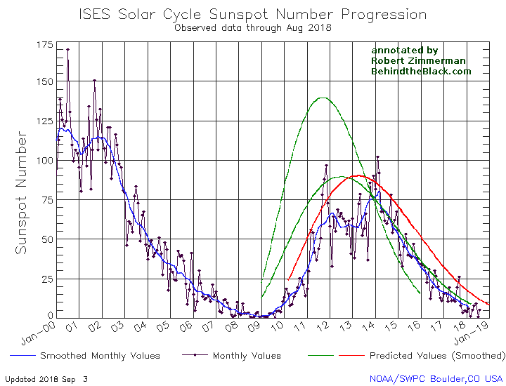
On February 3, 2020, NOAA posted its January of its monthly graph showing the long term sunspot activity of the Sun. As I have done now every month since this webpage began in 2011, it is posted below, with annotations:

After seven months of practically no sunspot activity, the longest such stretch in probably a century, January had a tiny burst of activity, breaking that string. Of the month’s four sunspots, two had a polarity from the old solar cycle, two from the new.

January 2020 sunspot activity
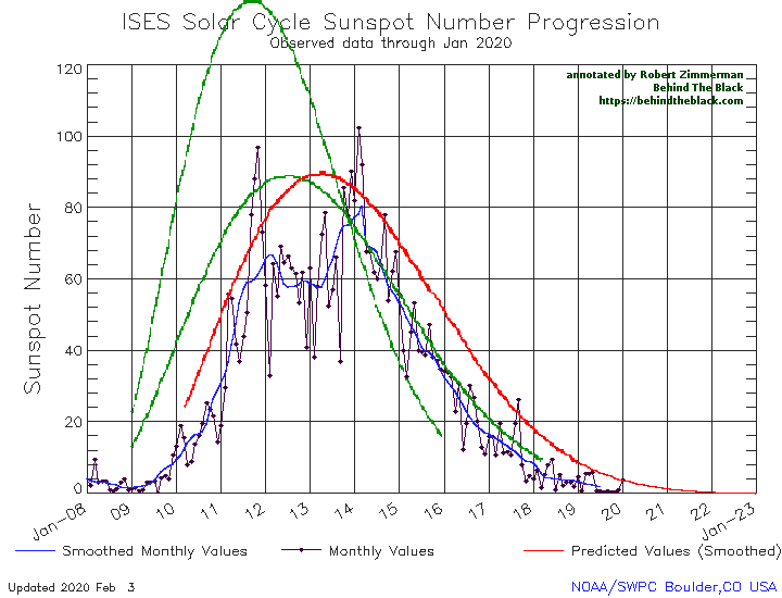
The graph above has been modified to show the predictions of the solar science community for the previous solar maximum. The green curves show the community’s two original predictions from April 2007, with half the scientists predicting a very strong maximum and half predicting a weak one. The red curve is their revised May 2009 prediction, extended in November 2018 four years into the future.

Despite their low number and general weakness, the continuing appearance of sunspots with polarities aligned with the new cycle strongly indicates that we will have a solar maximum in the next five years, not a grand minimum lasting decades that some scientists are predicting. While the year is young and it is certainly too soon to trust any trends, the fact that January saw an increase in activity over the past seven months suggests that we might have passed the low point of the minimum. We shall find out this year.

It must be remembered that the uncertainties in this field of science remain gigantic. No one really understands why the Sun’s magnetic dynamo goes through these cycles and flips in polarity. No one really understands why it produces sunspots as it does. And no one for sure yet knows exactly how the Sun’s cyclical behavior directly effects the climate. We only have circumstantial evidence, some of which can be legitimately questioned.

What is certain is that we don’t know very much, and are always in error when we forget this fact. Remember this always when some politician or scientist claims the science is settled or certain, and they know without doubt what is going to happen. They are either lying, fooling themselves, or are simply fools. In any case, such certainty in science should never be trusted.

Sunspot update for August 2018: The slide to minimum

As it does the first Sunday of each month, yesterday NOAA posted its monthly update of the solar cycle, covering sunspot activity for August 2018. And as I do every month, I am posting it below, annotated to give it some context.

The Sun in August had a slight uptick in sunspot activity, but not a very significant one. As such, the slide to solar minimum continues. Right now the lack of sunspot activity in 2018 is heading to match or even exceed 2007, the year in which the previous solar minimum began.

August 2018 sunspot activity

The graph above has been modified to show the predictions of the solar science community. The green curves show the community’s two original predictions from April 2007, with half the scientists predicting a very strong maximum and half predicting a weak one. The red curve is their revised May 2009 prediction.

If you look at the original graph at NOAA, you will see that we are getting very close to the right edge of the graph. I expect that sometime in the next few months NOAA will update the graph, a necessary act that will in one sense be a shame, as they have been adding monthly updates to this graph since the beginning of the last solar minimum. This has allowed everyone to see a standard visual, month to month, for comparing solar activity. It has also allowed me to annotate the graph properly to show how the 2007 and 2009 predictions held up against actual activity. Once the graph changes it will be more difficult to do this.

Anyway, it is very clear we are entering solar minimum, and that the solar cycle we are now completing will be both a short and weak cycle. What happens next is really the big question. Will the Sun sunspot activity recover? Or will we enter the first grand minimum since the 1600s? Either way, for solar scientists the coming years are going to be very exciting.

Posted on interstate 10 going from Tucson to Phoenix, on the way to the wooded northern forests of Arizona, where Diane and I will spend a couple of days visiting friends at their upstate cabin/home.

Sunspot ramp down resumes

On Monday NOAA posted its monthly update of the solar cycle. I am posting it here, as I do every month, with annotations to give it context.

September 2016 Solar Cycle graph

The graph above has been modified to show the predictions of the solar science community. The green curves show the community’s two original predictions from April 2007, with half the scientists predicting a very strong maximum and half predicting a weak one. The red curve is their revised May 2009 prediction.

After two months of increased sunspot activity, the decline in sunspots resumed in September, though activity did not drop significantly. Overall though, the ramp down towards the next solar minimum continues to track quite closely the ramp down predicted by weak prediction made by half the solar science community back in 2007 (the lower green curve above). These scientists however do not have much to brag about. Their same prediction completely missed the ramp up, which happened a year later than predicted, as well as the activity peak, which was far weaker than predicted.

In fact, the ramp down now continues to point to the possibility that this very weak solar cycle will also be a very short one, something that is quite unprecedented, and suggests that we might be seeing the lead in to another Grand Minimum, where there are no sunspots for decades. Since no one understands yet exactly why such grand minimums happen, however, this remains pure speculation. We will only find out by watching what happens, as it happens.

Ramp down to solar minimum continues

On Sunday NOAA posted its monthly update of the solar cycle, showing the Sun’s sunspot activity in May. As I have done since 2010, I am posting it here, with annotations to give it context.

May 2015 Solar Cycle graph

The graph above has been modified to show the predictions of the solar science community. The green curves show the community’s two original predictions from April 2007, with half the scientists predicting a very strong maximum and half predicting a weak one. The red curve is their revised May 2009 prediction.

Sunspot activity once again increased in May, though it continues to remain below the 2009 prediction of activity. Though it is still early in the ramp down, a look at the present pattern suggests that (as I also noted last month) sunspot activity is declining much faster than normal. In the past, the ramp down after solar maximum was long and drawn out, while ramp up was much faster. This ramp down seems much more precipitous than past solar cycles.

I should add that in early April Sunspot Index and Long-term Solar Observations (SILSO) had declared that the peak of the solar maximum had occurred in April 2014, and that they could now sum up the overall weakness of this maximum.

Cycle 24 proves to be 30% weaker than the previous solar cycle, which reached 119.7 in July 2000, and thus belongs to the category of moderate cycles, like cycles 12 to 15, which were the norm in the late 19th and early 20th century. Compared to strong cycles, such cycles typically feature a broader maximum, with a 3-year plateau on top of which two or more surges of activity can produce sharp peaks of similar height.

I had missed this announcement when it was first posted. It is worth noting however, especially since their discussion in April is interesting to read in the context of what has happened since.

Sunspot activity tracks prediction

On Monday NOAA posted its monthly update of the solar cycle, showing the sunspot activity for the Sun in January. As I do every month, I am posting it here below the fold, with annotations to give it context.

As I have noted previously, the ramp down from solar maximum continues to track the 2009 prediction of the solar scientist community (indicated by the red curve) quite closely. As NOAA also notes,

While awaiting final confirmation, all evidence points to the most recent solar maximum having peaked at 82 in April, 2014. This was within the expected range for the peak, but occurred significantly later than predicted.

Since their graph doesn’t show the entire curves for their predictions, the above statement seems reasonable. However, looking at the graph with those curves inserted (see my annotated graph below the fold), it becomes clear that not only did the peak occur much later than predicted, the maximum’s overall activity was also generally less than predicted.
» Read more