One of NASA’s two STEREO solar probes has gone dead
Six weeks ago one of the two STEREO probes that observe the hemisphere of the Sun that faces away from Earth went dead, and NASA engineers do not know why.
Six weeks ago one of the two STEREO probes that observe the hemisphere of the Sun that faces away from Earth went dead, and NASA engineers do not know why.
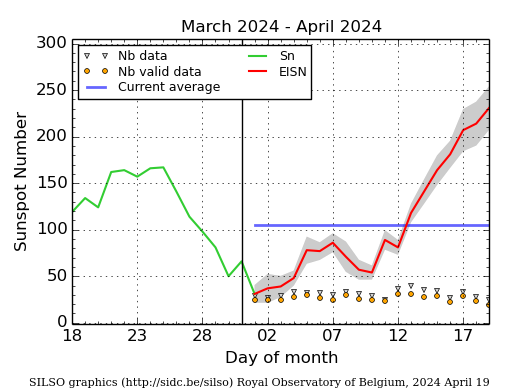
The monthly update by NOAA of the solar cycle is out, showing the sunspot activity for the Sun in October, As I do every month, I am posting it here, with annotations to give it context.
Despite the appearance last month of the largest sunspot in almost a quarter century, the number of sunspots in October dropped significantly, bringing overall activity back to levels seen in 2012, prior to the second peak in the solar maximum. If things go as expected (not something I would bet much money on), the overall ramp down of sunspot activity should now continue over the next few years. There will obviously be jumps periodically, but the general output of sunspots should steadily decline.
I also want to reiterate what I noted last month, that the 2009 prediction of the solar scientist community is looking better and better with time. Other than over-estimating the total activity somewhat while missing the dip between the two peaks, their overall curve, indicated by the red line, is reasonably close to what has actually happened.
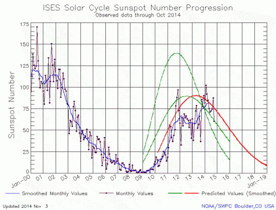
The graph above has been modified to show the predictions of the solar science community. The green curves show the community’s two original predictions from April 2007, with half the scientists predicting a very strong maximum and half predicting a weak one. The red curve is their revised May 2009 prediction.
Want to know the overall context of the biggest sunspot in almost 25 years, even as it rotates off the Sun’s face? Read this.
Based on past history, this sunspot will be long lasting. As this appears to be its first rotation, it will likely return in about two weeks when the Sun completes another half-rotation.
The largest sunspot seen in about a quarter century produced another powerful X-class flare today, the sixth in less than a week.
This was the sixth X-class solar flare from NOAA 2192, a record for the number of X-class flares generated by a single group so far this solar cycle. It was also the fourth X-class flare since last Friday, continuing a period of intense flaring activity. This sunspot group has grown again a bit, and maintains its magnetic complexity. A degradation of the HF radio-communication was observed over South-America, the Caribbean, and West-Africa.
The last sentence is referring to some radio communications blackouts that have occurred in these areas because of the flares. For more information about the sunspot itself, go here.
And in case you hadn’t noticed, as predicted by many doomsday fear-mongers in the science community, our technological civilization was destroyed by these flares and we are now all dead.
A new study suggests that the increased cosmic radiation reaching the inner solar system because of the Sun’s weak sunspot activity will increase the exposure to dangerous radiation levels for interplanetary astronauts, thus limiting mission lengths to about one year.
The new research finds that, during periods of low solar activity, a 30-year-old astronaut can spend roughly one year in space—just enough time to get to Mars and back—before the constant bombardment by cosmic rays pushes the risk of radiation-induced cancer above current exposure limits.
If the sun’s activity continues to weaken as many scientists predict, the number of days humans could spend in deep space before reaching their exposure limit could decrease by about 20 percent, making future crewed space flight more dangerous, according to the new study accepted for publication in Space Weather, a journal of the American Geophysical Union.
The numbers were worse for women, whose exposure would become dangerous in only 300 days, according to the study.
Last week NOAA posted its monthly update of the solar cycle, showing the sunspot activity for the Sun in September. As I do every month, I am posting it here, below the fold, with annotations to give it context.
As much as I am always willing to point out the errors and foibles of scientists when they get something wrong or overstate their conclusions, I also believe it right to give credit when credit is due. I have been saying for several years now that the prediction of the solar scientist community, indicated by the red curve in the graph below the fold, had seriously overstated the Sun’s sunspot production during this solar maximum.
Well, it now appears that, as the solar cycle continues to run its course, that their May 2009 prediction is becoming increasingly correct.
» Read more
An alert has been issued so that the electrical grids can been properly prepared to avoid damage by the impact of these two coronal mass ejections (CME) against the Earth’s magnetic field.
The first of the two CMEs predicted to arrive today made its appearance right on time. G1 ((Minor) geomagnetic storming is expected to begin within the next few hours with a maximum projected level of G2 (Moderate) storms for September 12th. A G3 (Strong) Geomagnetic Storm Watch is still in effect for September 13th due to the combined influence of this CME and the one projected to arrive late on the 12th. G1 (Minor) storming is likely to continue into September 14th. In addition, the S1 (Minor) solar radiation storm that is in progress as a result of the eruption on September 10th is expected to persist for the next few days with a possible slight increase with the arrival of the CMEs. Keep in mind that the forecast periods listed are in Universal Time so aurora watchers in the northern U.S. should be looking for possible activity tonight through Saturday night.
While there has been a lot of fear-mongering about these two CMEs, I expect that the only consequences we will see from both, the biggest to hit the Earth during this solar maximum, will be the possibility that the northern lights might be visible in places farther south than normal.
On Monday NOAA posted its monthly update of the solar cycle, showing the sunspot activity for the Sun in August. As I do every month, I am posting it here, below the fold, with annotations to give it context.
The sunspot activity of the Sun in August hovered at the same levels seen in July. Though the month had seen periods of little activity, these were interspersed with many violent flaring sunspots, including one that only yesterday unleashed a powerful X-class flare that is expected to send a coronal mass ejection directly at the Earth and should impact the Earth’s magnetic field on September 12. Expect spectacular auroras!
» Read more
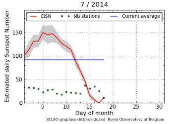
On Monday NOAA posted its monthly update of the solar cycle, showing the sunspot activity for the Sun in July. As I do every month, I am posting it here, below the fold, with annotations to give it context.
For the first time in four months the decline in sunspots ceased, though the sunspot count hardly rose either. Instead the numbers stayed almost the same in July as they were in June. This was during a month that began with lots of sunspots, and yet saw the first blank sun in almost three years. In fact, the Sun’s activity in July was a roller coaster, as noted by the Solar Influences Data Analysis Center (SIDC) of the Royal Observatory of Belgium.
» Read more
For the first time since August 14, 2011, the Sun showed no sunspots on its surface today. It started the day, July 17, 2014, with one small sunspot, but that spot apparently decayed away by the end of the day, as indicated by the fact that the sunspot number for the day was listed as zero, the first time that has happened since the solar maximum ramp up began in 2011.
This is strong evidence that the ramp down to solar minimum is beginning.
Communications with the two solar-observing Stereo spacecraft will be cut off for more than a year, far longer than originally expected, as their orbits move them behind the Sun.
Unexpectedly high temperatures in the high gain antenna feed horns on both STEREO spacecraft will require corrective action in the coming months that will severely limit science operations. The high temperatures are being caused by the small angle between Earth and the Sun as seen from each spacecraft. In other words, pointing the antenna at Earth is putting too much solar heat on the antenna feed horn. To bring down the feed horn temperature, and preserve the spacecraft for years to come, the antennas will be pointed off at an angle from both Earth and the Sun, so that less heat will fall on the feed horns. Communication will still be possible using one of the antenna side lobes, but the telemetry rate will be extremely low. What instrument operations can be supported while the antennas are off-pointed is still being studied.
The spacecrafts’ orbit allows them to observe the back side of the Sun not visible from Earth. Though engineers had expected to lose communications for a period of time when the Sun moved between the spacecraft and the Earth, the blacked out time period has turned out to be much longer than planned. The shutdown will begin later this year with communications not resuming until January 2016.
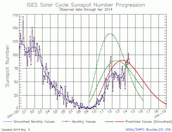
Last week NOAA posted its monthly update of the solar cycle, showing the sunspot activity for the Sun in April. As I do every month, I am posting it here, with annotations to give it context.

The graph above has been modified to show the predictions of the solar science community. The green curves show the community’s two original predictions from April 2007, with half the scientists predicting a very strong maximum and half predicting a weak one. The red curve is their revised May 2009 prediction.
For the third month in a row the Sun continued its drop in sunspots, with the total finally slipping below the 2009 prediction for this moment in the solar cycle. If this decline continues through to solar minimum, the shape of the solar maximum will essentially have been established, double-peaked with the second peak stronger than the first, something that solar scientists have never seen before.
At the moment I await word from the scientists that the Sun has completed the flip of its magnetic field polarity in the southern hemisphere. This flip has already occurred in the northern hemisphere, and when the south follows, the maximum will be officially over and we will officiallybegin the ramp down to solar minimum.
The uncertainty of science: Solar scientists admit they at this point have no idea what the Sun will do after it completes is present solar maximum.
I’ve only been say this now for six years. I’m glad the scientists have finally come around to admitting it strongly and in public.
Two weeks ago NOAA posted its monthly update of the solar cycle, showing the sunspot activity for the Sun in April. I have been remiss about doing my monthly post about this, so here it is now, posted below with annotations.
The graph above has been modified to show the predictions of the solar science community. The green curves show the community’s two original predictions from April 2007, with half the scientists predicting a very strong maximum and half predicting a weak one. The red curve is their revised May 2009 prediction.
The Sun continued the drop in sunspots seen the previous month, though the total number remains above the 2009 prediction for this moment in the solar cycle. As already noted, that the second peak of this double peaked solar maximum has been much stronger than the first remains unprecedented.
Overall, the maximum continues to be the weakest seen in a hundred years. Whether this is an indicator of future events or an anomaly can only be discovered after the Sun completes this solar solar cycle and begins the ramp up to its next solar maximum, at least five years away.
The next update is only a few weeks away. Stay tuned.
It’s sunspot time again! On Monday NOAA posted its monthly update of the solar cycle, showing the sunspot activity for the Sun in February. I am once again posting it here, below the fold, with annotations.
Like it did in January, the Sun’s second peak of the solar maximum continued to beat its first peak, an unprecedented event. Though activity dropped slightly, it still remained above prediction and was only slightly below the first peak’s maximum. Overall, the second peak has been much stronger than the first, something that scientists have never seen before. In the past, when the Sun had a double peaked solar maximum, the second peak was always weaker. Not this time!
» Read more
On Monday NOAA posted its monthly update of the solar cycle, showing the sunspot activity for the Sun in January. As I do every month, I am posting it here, below the fold, with annotations.
January was the most active month for sunspots this entire solar cycle, exceeding the predictions of the solar scientists, an event that has been quite rare during this generally weak solar maximum. In fact, the Sun was so active that for the first time, the second peak in a double-peaked solar maximum exceeded the first peak in sunspot activity.
» Read more
NOAA this week posted its monthly update of the solar cycle, showing the sunspot activity for the Sun in January. As I do every month, I am posting it here, below the fold, with annotations.
Back in October the Sun’s sunspot activity had plummeted, following almost two years of very weak activity. At that time, I wrote, “It appears the solar maximum has ended. The only question now is how long and deep the upcoming solar minimum will be.”
Well, talk about foolish predictions. I should shake hands with Al Gore and James Hansen for making the mistake of announcing the future as if I know what will happen. The truth is that no one truly understands the Sun’s sunspot cycle.
In January the Sun continued the high sunspot activity of the previous three months, once again producing sunspots in numbers close to the actual predictions of the solar science community. And while all their predictions remain generally high when compared to the actual numbers, they can now feel reassured that the overall length and strength of this solar maximum is beginning to resemble the prediction of the solar scientists who thought this would be a weak maximum.
» Read more
Earlier this week NOAA posted its monthly update of the solar cycle, showing the sunspot activity for the Sun in December. As I do every month, I am posting it here, below the fold, with annotations.
December was an active month for sunspots, so much so that for only the second time during this solar maximum has the Sun’s activity actually met and exceeded the predictions of the solar science community. In fact, the Sun’s high activity in both November and December has made this second peak in solar maximum almost as strong as the first peak in October 2011. Normally, the second peak of a double-peaked maximum is relatively weak. Not so this time.
The big solar hotshots of 2013.
The article is a nice and visually fascinating overview of the twelve most impressive solar events during the past year. Interestingly, I think #7 is the most significant in that it involved things that didn’t happen.
As small sunspot group NOAA 1838 was falling apart, another active region NOAA 1839 appeared just in time to avoid a spotless day, which would have been the first since 14 August 2011! A spotless day during a solar cycle maximum is not uncommon, but it remains of course a rare event. This absolute low in sunspot number highlighted a period of very low solar activity, with hardly any flares (no C-flares from 7 till 17 September: 11 consecutive days) and no (minor) geomagnetic storms for a full month! Meanwhile, the magnetic field near the solar north pole (finally) completed its reversal, whereas this magnetic flip is still ongoing at the south pole. These reversals testify we’re close to the maximum of solar cycle 24. [emphasis mine]
The phrases in bold clarify where we presently stand with the solar cycle. The southern magnetic field is in the process of reversing, but has not yet completed the flip.
Today NOAA posted its monthly update of the solar cycle, showing the sunspot activity for the Sun in November. As I do every month, I am posting it here, below the fold, with annotations.
As in October, the Sun was more active than it has been for this entire solar maximum. November’s numbers dropped slightly from October, but still remained high, though as has been typical for this solar maximum they remained below prediction.
» Read more