Sunspots continue predicted decline

On Sunday NOAA posted, as it does each month, its monthly update of the solar cycle, showing the Sun’s sunspot activity in November. And as I have done every month since 2010, I am posting it here, with annotations to give it context.

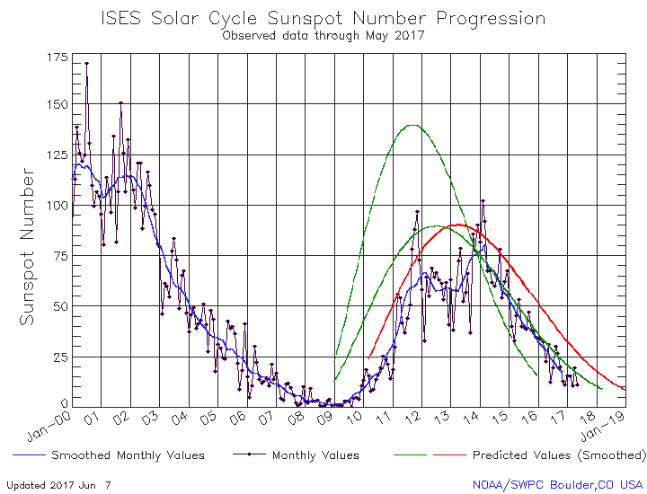
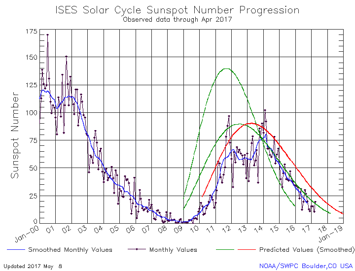
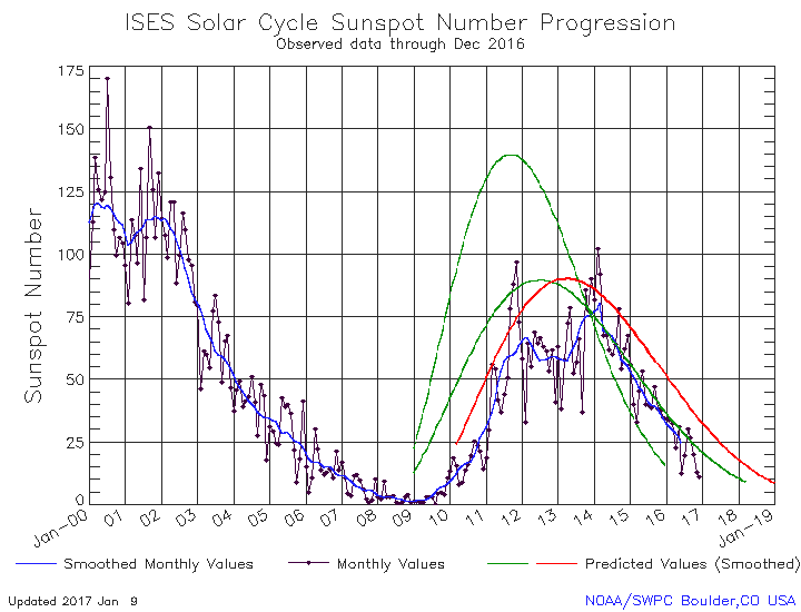
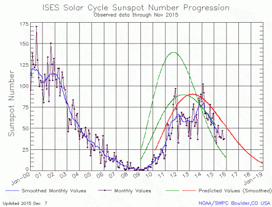
Though sunspot activity in November was just slightly higher than in October, the increase was so small that it is insignificant. Essentially, the overall decline in sunspot count continues, matching almost perfectly the ramp down predicted by the 2007 low prediction. Solar activity continues to be far weaker then anything seen in a century. Whether this suggests a coming Grand Minimum, however, is not known. Solar activity could continue to decline as we move into the next solar cycle, or it could recover. Our understanding of what causes the sunspot cycle remains somewhat fuzzy, which means our ability to predict what will happen next is as fuzzy..

November 2015 Solar Cycle graph

The graph above has been modified to show the predictions of the solar science community. The green curves show the community’s two original predictions from April 2007, with half the scientists predicting a very strong maximum and half predicting a weak one. The red curve is their revised May 2009 prediction.

Decline to solar minimum continues

It’s that time again buckos! On Monday NOAA posted its monthly update of the solar cycle, showing the Sun’s sunspot activity in October. As I have done every month since 2010, I am posting it here, with annotations to give it context.

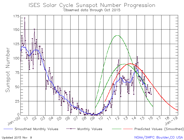
The decline in sunspot continue steadily, matching the red prediction curve except that, as it has for this entire solar maximum, the number of sunspots continues to be less than expected. Not only did the ramp up start later and not quite reach the levels predicted, the ramp down started early. Overall, this now ending solar maximum is the weakest in a century. The big question remains: Is the Sun about to head into its first Grand Minimum since the 1600s, or is this weak maximum a one-time event to be followed by stronger activity in later cycles.

No matter what anyone tells you, no one knows.

October 2015 Solar Cycle graph

The graph above has been modified to show the predictions of the solar science community. The green curves show the community’s two original predictions from April 2007, with half the scientists predicting a very strong maximum and half predicting a weak one. The red curve is their revised May 2009 prediction.

Solar ramp down jumps slightly

My original post about NOAA’s October update to its monthly tracking of the Sun’s sunspot cycle contained an incorrect graph. For reasons I do not understand, the first graph they posted did not include the data for September, thus creating for me the illusion that little had changed in September. I am now posting the correct graph here, below the fold, with annotations to give it context.

In September numbers showed a slight jump in sunspot activity, though once again nothing so significant as to change the overall trends. Moreover, the correction doesn’t change what I wrote previously in any way: the rate of decline seems to have transitioned down from the 2009 prediction (red curve) to the 2007 weak prediction (lower green curve). This doesn’t real mean much, as the sunspot number can still vary up and down considerable before we reach solar minimum in two or three years.

» Read more

Ramp down in sunspots continues

Correction! For reasons I do not understand, the graph below, originally posted on the NOAA website, was incorrect and was changed several days after I posted my piece below. See this post for the correct graph and analysis.

The uncertainty of science: On Monday NOAA posted its monthly update of the solar cycle, showing the Sun’s sunspot activity in September. Once again I post it here, below the fold, with annotations to give it context.

For the third month in a row the sunspot count dropped a tiny amount, lingering at about the same number as the previous two months. Moreover, the rate of decline seems to have transitioned down from the 2009 prediction (red curve) to the 2007 weak prediction (lower green curve). This doesn’t real mean much, as the sunspot number can still vary up and down considerable before we reach solar minimum in two or three years.

» Read more

Decline to solar minimum

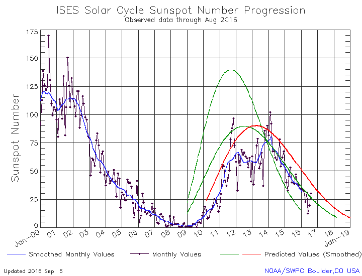
Last week NOAA posted its monthly update of the solar cycle, showing the Sun’s sunspot activity in August. As I have done every month since 2010, I am posting it here, below the fold, with annotations to give it context.

The sunspot count continued its decline, though dropping only a small amount. Regardless, the decline continues at a rate far faster than predicted or is usual during the ramp down from solar maximum. If this rate of decline should continue, we will reach solar minimum sometime late in 2017, two years earlier than predicted (as indicated by the red curve).

» Read more

The sunspot decline continues

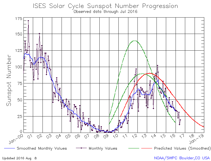
On Monday NOAA posted its monthly update of the solar cycle, showing the Sun’s sunspot activity in July. As I have done every month since 2010, I am posting it here, below the fold, with annotations to give it context.

Sunspot counts continue to decline at a rate faster than predicted or is usual during ramp down from solar maximum. Normally the ramp down is slow and steady. This time it has so far been more precipitous. While the 2009 prediction of the solar science community (indicated by the red curve) suggests minimum will occur sometime after 2020, the actual counts suggest it will occur much sooner.

» Read more

A new double dynamo theory to explain the Sun’s solar cycle

A team of solar scientists have proposed a new theory that they think explains the ebb and flow of the Sun’s eleven year solar cycle, and if right can explain the periodic occurrence of grand minimums where there are essentially no sunspots for decades, such as the Maunder Minimum in the 1600s.

The theory proposes that the Sun has two different dynamos that produce different magnetic waves in its interior. Like waves that can either cancel each other out or combine for more power, these two dynamos do the same over time and thus effect the Sun’s sunspot/solar cycle.

“We found magnetic wave components appearing in pairs, originating in two different layers in the Sun’s interior. They both have a frequency of approximately 11 years, although this frequency is slightly different, and they are offset in time. Over the cycle, the waves fluctuate between the northern and southern hemispheres of the Sun. Combining both waves together and comparing to real data for the current solar cycle, we found that our predictions showed an accuracy of 97%,” said Zharkova.

Zharkova and her colleagues derived their model using a technique called ‘principal component analysis’ of the magnetic field observations from the Wilcox Solar Observatory in California. They examined three solar cycles-worth of magnetic field activity, covering the period from 1976-2008. In addition, they compared their predictions to average sunspot numbers, another strong marker of solar activity. All the predictions and observations were closely matched.

Looking ahead to the next solar cycles, the model predicts that the pair of waves become increasingly offset during Cycle 25, which peaks in 2022. During Cycle 26, which covers the decade from 2030-2040, the two waves will become exactly out of synch and this will cause a significant reduction in solar activity.

“In cycle 26, the two waves exactly mirror each other – peaking at the same time but in opposite hemispheres of the Sun. Their interaction will be disruptive, or they will nearly cancel each other. We predict that this will lead to the properties of a ‘Maunder minimum’,” said Zharkova. “Effectively, when the waves are approximately in phase, they can show strong interaction, or resonance, and we have strong solar activity. When they are out of phase, we have solar minimums. When there is full phase separation, we have the conditions last seen during the Maunder minimum, 370 years ago.”

And on this same subject, last week NOAA posted its monthly update of the solar cycle, showing the Sun’s sunspot activity in June. As I have done every month since 2010, I am posting it here, below the fold, with annotations to give it context.
» Read more

Ramp down to solar minimum continues

On Sunday NOAA posted its monthly update of the solar cycle, showing the Sun’s sunspot activity in May. As I have done since 2010, I am posting it here, with annotations to give it context.

May 2015 Solar Cycle graph

The graph above has been modified to show the predictions of the solar science community. The green curves show the community’s two original predictions from April 2007, with half the scientists predicting a very strong maximum and half predicting a weak one. The red curve is their revised May 2009 prediction.

Sunspot activity once again increased in May, though it continues to remain below the 2009 prediction of activity. Though it is still early in the ramp down, a look at the present pattern suggests that (as I also noted last month) sunspot activity is declining much faster than normal. In the past, the ramp down after solar maximum was long and drawn out, while ramp up was much faster. This ramp down seems much more precipitous than past solar cycles.

I should add that in early April Sunspot Index and Long-term Solar Observations (SILSO) had declared that the peak of the solar maximum had occurred in April 2014, and that they could now sum up the overall weakness of this maximum.

Cycle 24 proves to be 30% weaker than the previous solar cycle, which reached 119.7 in July 2000, and thus belongs to the category of moderate cycles, like cycles 12 to 15, which were the norm in the late 19th and early 20th century. Compared to strong cycles, such cycles typically feature a broader maximum, with a 3-year plateau on top of which two or more surges of activity can produce sharp peaks of similar height.

I had missed this announcement when it was first posted. It is worth noting however, especially since their discussion in April is interesting to read in the context of what has happened since.

The Sun drifts downward

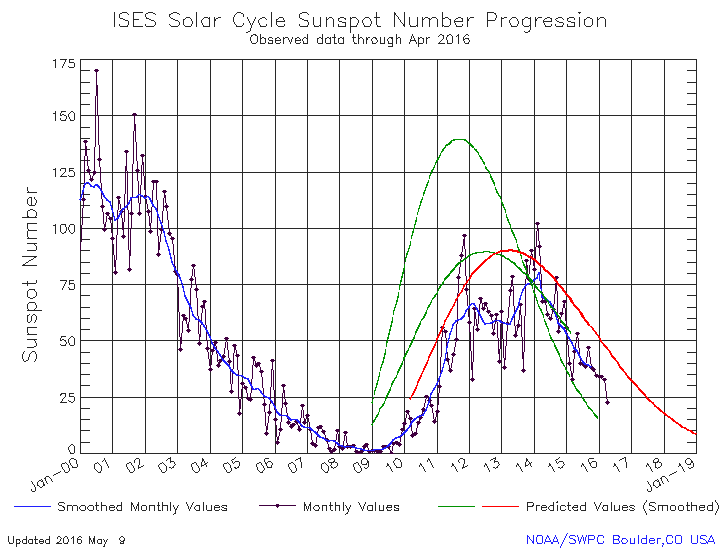
NOAA today posted its monthly update of the solar cycle, showing the Sun’s sunspot activity in April. As always, I am posting it here, with annotations to give it context, as I have done since 2010.

April 2015 Solar Cycle graph

The graph above has been modified to show the predictions of the solar science community. The green curves show the community’s two original predictions from April 2007, with half the scientists predicting a very strong maximum and half predicting a weak one. The red curve is their revised May 2009 prediction.

Though sunspot activity increased in April, it remained well below the predicted numbers from the 2009 prediction, as has sunspot activity generally done for this entire solar cycle.

Note that if you extrapolate the red curve of the 2009 prediction down to its end you find that the solar minimum was predicted to occur sometime after 2020. Based on the rate of activity we have seen for the past year, it is very possible that the minimum will occur sooner, and will likely last longer.

But then again, the sun does what the sun wants to do. We don’t exactly understand the root causes of the solar cycle, and can only watch it unfold time after time as we try to peel back its mysteries.

The sunspot crash continues

On Sunday NOAA posted its monthly update of the solar cycle, showing the Sun’s sunspot activity in March. I am posting it here, with annotations to give it context, as I have done since 2010.

March 2015 Solar Cycle graph

The graph above has been modified to show the predictions of the solar science community. The green curves show the community’s two original predictions from April 2007, with half the scientists predicting a very strong maximum and half predicting a weak one. The red curve is their revised May 2009 prediction.

In February the Sun’s sunspot activity plunged, dropping way below the prediction of the solar science community. In March that plunge continued. Even though activity had seemed to track that prediction through most of 2014, the overall levels were always less than the prediction. The sunspot numbers for the past two months have simply made this fact obvious once again, dropping to levels almost as low as those last seen in 2011, before the onset of the solar maximum.

That the ramp down at this time is so precipitous is especially intriguing, as historically the ramp down from previous solar maximums has been slow and steady. It is once again evidence that the Sun is doing things that solar scientists have never yet had the opportunity to observe.

Sunspots crash in February


NOAA today posted its monthly update of the solar cycle, showing the sunspot activity for the Sun in February. As I have done monthly for the past five years, I am posting it here below the fold, with annotations to give it context.

In the past two months I have noted how the ramp down from solar maximum has closely tracked the 2009 prediction of the solar scientist community (indicated by the red curve).

In February, however, that close tracking ended, with sunspots plunging far below the prediction. Note also that sunspot activity in March has also been weak.

» Read more

SDO celebrates its fifth year in space with a time-lapse of the Sun

Cool images! In celebration of Solar Dynamics Observatory’s fifth year in space observing the Sun, the scientists at the Goddard Space Flight Center have released a time-lapse movie showing the Sun for the past five years.

Video below the fold. It is astonishing and hypnotic. The movie images were taken one image every 8 hours beginning in 2010. If you compare the Sun at the beginning of the movie with the end, you can see the slow shifting of sunspots/flares from higher to equatorial latitudes, as is normal as the solar cycle ramps up to solar maximum and beyond.
» Read more

Sunspot activity tracks prediction

On Monday NOAA posted its monthly update of the solar cycle, showing the sunspot activity for the Sun in January. As I do every month, I am posting it here below the fold, with annotations to give it context.

As I have noted previously, the ramp down from solar maximum continues to track the 2009 prediction of the solar scientist community (indicated by the red curve) quite closely. As NOAA also notes,

While awaiting final confirmation, all evidence points to the most recent solar maximum having peaked at 82 in April, 2014. This was within the expected range for the peak, but occurred significantly later than predicted.

Since their graph doesn’t show the entire curves for their predictions, the above statement seems reasonable. However, looking at the graph with those curves inserted (see my annotated graph below the fold), it becomes clear that not only did the peak occur much later than predicted, the maximum’s overall activity was also generally less than predicted.
» Read more

The sunspot cycle update for December

The monthly update by NOAA of the solar cycle, showing the sunspot activity for the Sun in December, was released this past weekend. As I do every month, I am posting it here, below the fold, with annotations to give it context.

Even though sunspot activity in December increased, the slow ramp down to solar minimum continues to track the 2009 prediction of the solar scientist community. The overall intensity of the solar maximum prior to 2014 was considerable less than this prediction, but the numbers throughout 2014 matched that prediction remarkably well.
» Read more

Solar maximum ramp down continues

The monthly update by NOAA of the solar cycle, showing the sunspot activity for the Sun in November, was released on December 8, just before NOAA completely revamped its website. As I have been doing every month for the past four years, I am posting it here, with annotations to give it context.

As noted in previous months, the 2009 prediction of the solar scientist community is looking better and better with time. Though there was an increase in sunspot activity in November, the overall trend continues downward very close to that prediction, though at levels that have generally been less than predicted.

November 2014 Solar Cycle graph

The graph above has been modified to show the predictions of the solar science community. The green curves show the community’s two original predictions from April 2007, with half the scientists predicting a very strong maximum and half predicting a weak one. The red curve is their revised May 2009 prediction.

Future updates will depend on whether NOAA continues to track sunspots using these same standards. After much searching I was finally able to locate the graph above at this link, suggesting that at least for now, they are holding to these standards. I note however that the links to the 2007 and the 2009 solar cycle predictions have vanished down the memory hole. Fortunately, I still have this data, and can continue to annotate the graphs to compare prediction with actual data.

That they might have removed these predictions from their webpage however is a shame. I have emailed them to ask them about this and will let you know what I learn.

Signs of a sunspot ramp down

The monthly update by NOAA of the solar cycle is out, showing the sunspot activity for the Sun in October, As I do every month, I am posting it here, with annotations to give it context.

Despite the appearance last month of the largest sunspot in almost a quarter century, the number of sunspots in October dropped significantly, bringing overall activity back to levels seen in 2012, prior to the second peak in the solar maximum. If things go as expected (not something I would bet much money on), the overall ramp down of sunspot activity should now continue over the next few years. There will obviously be jumps periodically, but the general output of sunspots should steadily decline.

I also want to reiterate what I noted last month, that the 2009 prediction of the solar scientist community is looking better and better with time. Other than over-estimating the total activity somewhat while missing the dip between the two peaks, their overall curve, indicated by the red line, is reasonably close to what has actually happened.

October 2014 Solar Cycle graph

The graph above has been modified to show the predictions of the solar science community. The green curves show the community’s two original predictions from April 2007, with half the scientists predicting a very strong maximum and half predicting a weak one. The red curve is their revised May 2009 prediction.

Largest sunspot in a quarter century spews flares

The largest sunspot seen in about a quarter century produced another powerful X-class flare today, the sixth in less than a week.

This was the sixth X-class solar flare from NOAA 2192, a record for the number of X-class flares generated by a single group so far this solar cycle. It was also the fourth X-class flare since last Friday, continuing a period of intense flaring activity. This sunspot group has grown again a bit, and maintains its magnetic complexity. A degradation of the HF radio-communication was observed over South-America, the Caribbean, and West-Africa.

The last sentence is referring to some radio communications blackouts that have occurred in these areas because of the flares. For more information about the sunspot itself, go here.

And in case you hadn’t noticed, as predicted by many doomsday fear-mongers in the science community, our technological civilization was destroyed by these flares and we are now all dead.

Solar minimum to limit interplanetary manned flights?

A new study suggests that the increased cosmic radiation reaching the inner solar system because of the Sun’s weak sunspot activity will increase the exposure to dangerous radiation levels for interplanetary astronauts, thus limiting mission lengths to about one year.

The new research finds that, during periods of low solar activity, a 30-year-old astronaut can spend roughly one year in space—just enough time to get to Mars and back—before the constant bombardment by cosmic rays pushes the risk of radiation-induced cancer above current exposure limits.

If the sun’s activity continues to weaken as many scientists predict, the number of days humans could spend in deep space before reaching their exposure limit could decrease by about 20 percent, making future crewed space flight more dangerous, according to the new study accepted for publication in Space Weather, a journal of the American Geophysical Union.

The numbers were worse for women, whose exposure would become dangerous in only 300 days, according to the study.

A reviving solar maximum

Last week NOAA posted its monthly update of the solar cycle, showing the sunspot activity for the Sun in September. As I do every month, I am posting it here, below the fold, with annotations to give it context.

As much as I am always willing to point out the errors and foibles of scientists when they get something wrong or overstate their conclusions, I also believe it right to give credit when credit is due. I have been saying for several years now that the prediction of the solar scientist community, indicated by the red curve in the graph below the fold, had seriously overstated the Sun’s sunspot production during this solar maximum.

Well, it now appears that, as the solar cycle continues to run its course, that their May 2009 prediction is becoming increasingly correct.
» Read more

The solar maximum lingers on

On Monday NOAA posted its monthly update of the solar cycle, showing the sunspot activity for the Sun in August. As I do every month, I am posting it here, below the fold, with annotations to give it context.

The sunspot activity of the Sun in August hovered at the same levels seen in July. Though the month had seen periods of little activity, these were interspersed with many violent flaring sunspots, including one that only yesterday unleashed a powerful X-class flare that is expected to send a coronal mass ejection directly at the Earth and should impact the Earth’s magnetic field on September 12. Expect spectacular auroras!
» Read more

The sun continues its ramp down

On Monday NOAA posted its monthly update of the solar cycle, showing the sunspot activity for the Sun in June. As I do every month, I am posting it here, below the fold, with annotations to give it context.

The decline in sunspots continued for the fourth month in a row, increasing the likelihood that the peak of solar maximum has finally come and gone and that we now seeing the beginning of the ramp down to solar minimum. This resulting solar maximum comes close to matching the science community’s final prediction (indicated by the red line), though that prediction was not detailed enough to include the distinct and unusual double peak for this maximum.
» Read more

Is the Sun’s strange double-peaked solar maximum finally ending?

Last week NOAA posted its monthly update of the solar cycle, showing the sunspot activity for the Sun in April. As I do every month, I am posting it here, with annotations to give it context.

May Solar Cycle graph

The graph above has been modified to show the predictions of the solar science community. The green curves show the community’s two original predictions from April 2007, with half the scientists predicting a very strong maximum and half predicting a weak one. The red curve is their revised May 2009 prediction.

For the third month in a row the Sun continued its drop in sunspots, with the total finally slipping below the 2009 prediction for this moment in the solar cycle. If this decline continues through to solar minimum, the shape of the solar maximum will essentially have been established, double-peaked with the second peak stronger than the first, something that solar scientists have never seen before.

At the moment I await word from the scientists that the Sun has completed the flip of its magnetic field polarity in the southern hemisphere. This flip has already occurred in the northern hemisphere, and when the south follows, the maximum will be officially over and we will officiallybegin the ramp down to solar minimum.

The Sun settling down?

Two weeks ago NOAA posted its monthly update of the solar cycle, showing the sunspot activity for the Sun in April. I have been remiss about doing my monthly post about this, so here it is now, posted below with annotations.

April Solar Cycle graph

The graph above has been modified to show the predictions of the solar science community. The green curves show the community’s two original predictions from April 2007, with half the scientists predicting a very strong maximum and half predicting a weak one. The red curve is their revised May 2009 prediction.

The Sun continued the drop in sunspots seen the previous month, though the total number remains above the 2009 prediction for this moment in the solar cycle. As already noted, that the second peak of this double peaked solar maximum has been much stronger than the first remains unprecedented.

Overall, the maximum continues to be the weakest seen in a hundred years. Whether this is an indicator of future events or an anomaly can only be discovered after the Sun completes this solar solar cycle and begins the ramp up to its next solar maximum, at least five years away.

The next update is only a few weeks away. Stay tuned.

The Sun continues to hiccup

It’s sunspot time again! On Monday NOAA posted its monthly update of the solar cycle, showing the sunspot activity for the Sun in February. I am once again posting it here, below the fold, with annotations.

Like it did in January, the Sun’s second peak of the solar maximum continued to beat its first peak, an unprecedented event. Though activity dropped slightly, it still remained above prediction and was only slightly below the first peak’s maximum. Overall, the second peak has been much stronger than the first, something that scientists have never seen before. In the past, when the Sun had a double peaked solar maximum, the second peak was always weaker. Not this time!
» Read more

The uncertainty of knowledge

NOAA this week posted its monthly update of the solar cycle, showing the sunspot activity for the Sun in January. As I do every month, I am posting it here, below the fold, with annotations.

Back in October the Sun’s sunspot activity had plummeted, following almost two years of very weak activity. At that time, I wrote, “It appears the solar maximum has ended. The only question now is how long and deep the upcoming solar minimum will be.”

Well, talk about foolish predictions. I should shake hands with Al Gore and James Hansen for making the mistake of announcing the future as if I know what will happen. The truth is that no one truly understands the Sun’s sunspot cycle.

In January the Sun continued the high sunspot activity of the previous three months, once again producing sunspots in numbers close to the actual predictions of the solar science community. And while all their predictions remain generally high when compared to the actual numbers, they can now feel reassured that the overall length and strength of this solar maximum is beginning to resemble the prediction of the solar scientists who thought this would be a weak maximum.
» Read more

Yippee! Solar scientists finally get it right

Earlier this week NOAA posted its monthly update of the solar cycle, showing the sunspot activity for the Sun in December. As I do every month, I am posting it here, below the fold, with annotations.

December was an active month for sunspots, so much so that for only the second time during this solar maximum has the Sun’s activity actually met and exceeded the predictions of the solar science community. In fact, the Sun’s high activity in both November and December has made this second peak in solar maximum almost as strong as the first peak in October 2011. Normally, the second peak of a double-peaked maximum is relatively weak. Not so this time.

» Read more

Scientists so good they can predict things after it happens

Normally I would post this tidbit when I do my monthly update of the Sun’s solar cycle, due out in sometime in the next week. However, this piece of news is so ridiculous that I have got to post it now, just so everyone can see how far science in the modern world has declined.

For the past three years I have documented the number of times the solar scientists at the Marshall Space Flight Center have changed their prediction for the number of sunspots during this solar maximum. They have revised their prediction so many times with such a large range that it appears that they really don’t have any real system or theory for making this prediction, but are merely guessing based on instinct, opinion, or tea leaves. Moreover, they do not archive their earlier predictions. If I wasn’t documenting them here monthly, there would be no way to know that while today they predict one thing (very close to what is the right number), two years ago their prediction was way off, In recent months, because the changes have become so absurd, I have been making screen captures of each change.

For the past two months they have been stating that the sunspot maximum had occurred during the summer of 2013 with an average daily sunspot number of 65. Below is my screen capture from when they made this change in November.
» Read more

1 3 4 5 6