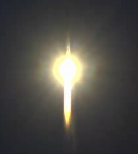
Click for full image.
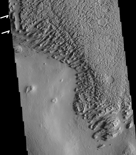
Today’s cool image is for once not taken by the high resolution camera on Mars Reconnaissance Orbiter (MRO). Instead, the image to the right, cropped and reduced to post here, was taken by Mars Odyssey on April 5, 2020, and shows the scouring and erosion caused by winds over many eons in a region dubbed Zephyria Planum. (Note that the image might fool your eye. Sunlight is coming from the east, and the rough terrain at the top is higher than the smooth plain at the bottom.)
Years ago, when I first started to rummage through the archives of images from the various Mars orbiters, I would have seen this image and posted it because I was completely baffled by what I saw, and thought that mystery made it worth showing to the public. Since then my incessant probing of research papers as well as asking a lot of questions of scientists has taught me a lot more about what scientists now surmise of the Martian geology. This greater knowledge in turn makes it possible for me to look at an image like this and immediately make a reasonable guess as to an explanation. This photo, while still containing much that is mysterious, is no longer completely baffling to me.
This willingness to ask questions and dig deeper is fundamental to all things. To have a deeper understanding and not simply guess about any subject, you always have to recognize that your assumptions are likely wrong, and that to learn anything you have to repeatedly ask what I call “the next question.” The first answer will force you to recognize that your first guesses are wrong, raise more questions, which in turn will lead to more questions, and then more questions, and so forth.
Whether I am researching Mars or early space history or politics, this rule always applies. Don’t leap to a conclusion. Think it possible you could be wrong. Ask the next question. And the next. You will repeatedly find that what you thought you knew was not correct, and in the end you will gain a deeper understanding of what is actually known about any subject, as well as what is unknown. And knowing the unknowns is probably the most important thing you can learn.
To gain a better understanding of today’s particular image, our first questions must start with context. Where is this feature on Mars? What is the surrounding history of that location? And what is already known about this place?
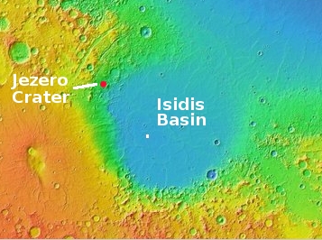
The location immediately reveals a great deal, as shown in the overview map below.
» Read more