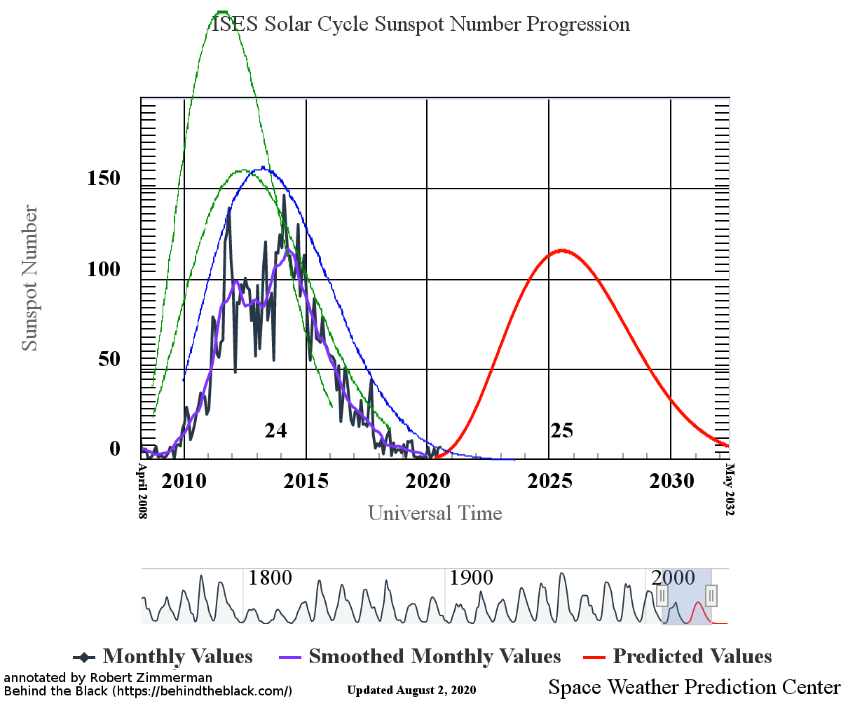
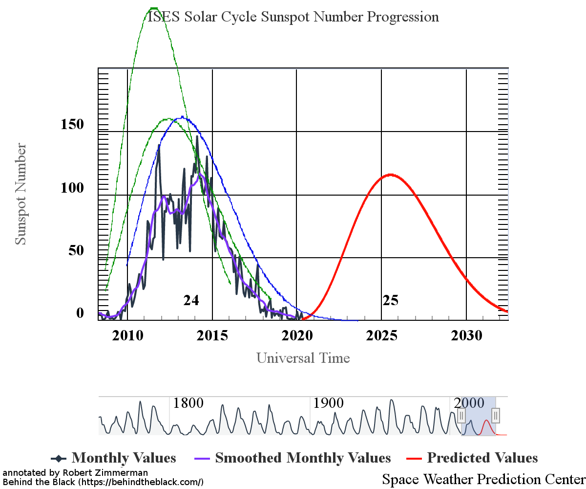
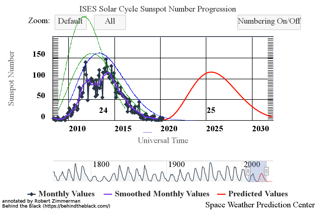
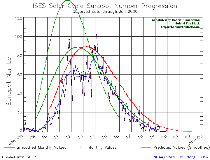
NOAA this week released its February update of its monthly graph showing the long term sunspot activity of the Sun. Below is my monthly version, annotated as I have done every month since 2011.
After a tiny uptick in sunspot activity in January, the Sun resumed the unprecedented flatlining of sunspot activity that began last June. Since then, the Sun has produced practically no sunspots, a drought that as far as I can tell has never happened since the 11-year sunspot cycle resumed in the 1700s (after the grand minimum in the 1600s) and astronomers began counting sunspots.

The graph above has been modified to show the predictions of the solar science community for the previous solar maximum. The green curves show the community’s two original predictions from April 2007, with half the scientists predicting a very strong maximum and half predicting a weak one. The red curve is their revised May 2009 prediction, extended in November 2018 four years into the future.
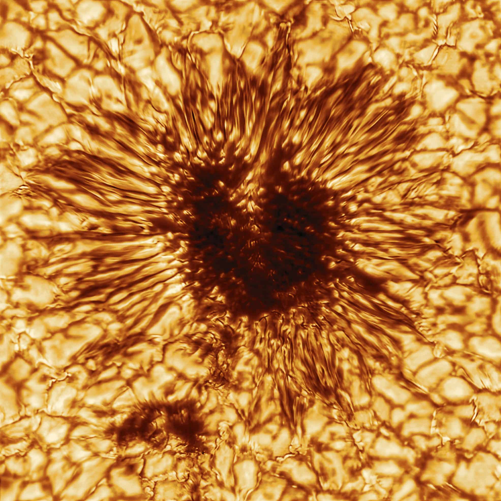
February saw only one sunspot, and it belonged to the old solar cycle. It also occurred at the beginning of the month, and was followed by 33-day streak of blankness, into the middle of March, when a sunspot from the new cycle appeared and quickly faded.
The continuing overall lack of sunspots, from either the old or new cycle, does not mean that we are entering a new grand minimum, with no sunspots for decades (though some scientists believe we are). It does suggest however that the next solar maximum will be weak, and very likely weaker than the very weak maximum that just ended.
Why the Sun does this remains a mystery. Scientists really have no fundamental understanding of the magnetic processes that produce the Sun’s sunspot cycles. And since that cycle appears to have some effect on the Earth’s climate, it also means scientists do not yet have a fundamental understanding of the climate either.
Not that this lack of knowledge matters anymore. We are in an age of panic and certainty, based on emotion and feelings. All that matters is that many people feel they understand the climate and how the Sun works, just as everyone is sure that COVID-19 will destroy the world if we don’t shut down all human activity.
They are certain, and any additional data that illustrates that certainty is unwarranted is irrelevant and must be ignored.
Certainty however is a very dangerous thing. The universe is always more complicated than we know, and to assume we now understand all without doubt leaves us very vulnerable to some bad surprises, as well as the chance we will take actions that are foolish, inappropriate, and even downright evil.